Sugar Teddy
Sugar Teddy is a Ukrainian brand of sugar-free bars with a rebel bear for a face and a loud, cheeky voice.
UX/UI for its online store on desktop and phone, from wireframes to the home page, catalog, product page, cart, checkout, service pages and a 404 with the bear.
An online store with attitude
Sugar Teddy makes sugar-free bars and says so with a grin: the first rule of Sugar Teddy is no sugar, the second rule is no sugar at all. The brand speaks through a rebel bear with a star over one eye, and the store had to sound the same. We designed it in Ukrainian, in the brand orange with black and a lime button colour, from wireframes to the final pages on desktop and phone. The footer credit reads that it was made gluten- and sugar-free by thelegacy.
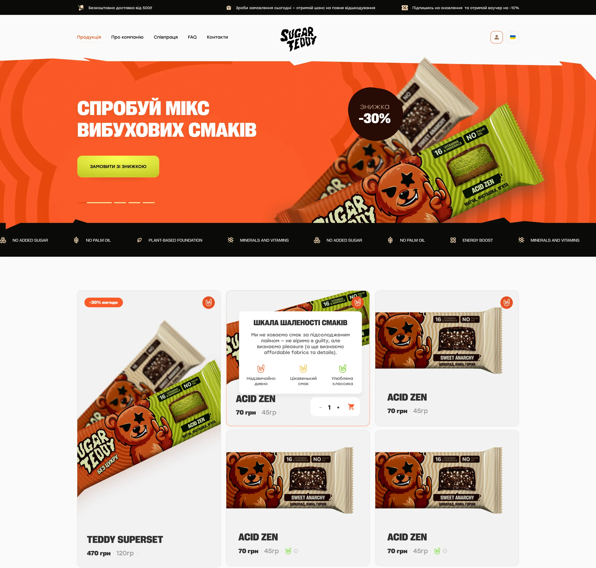
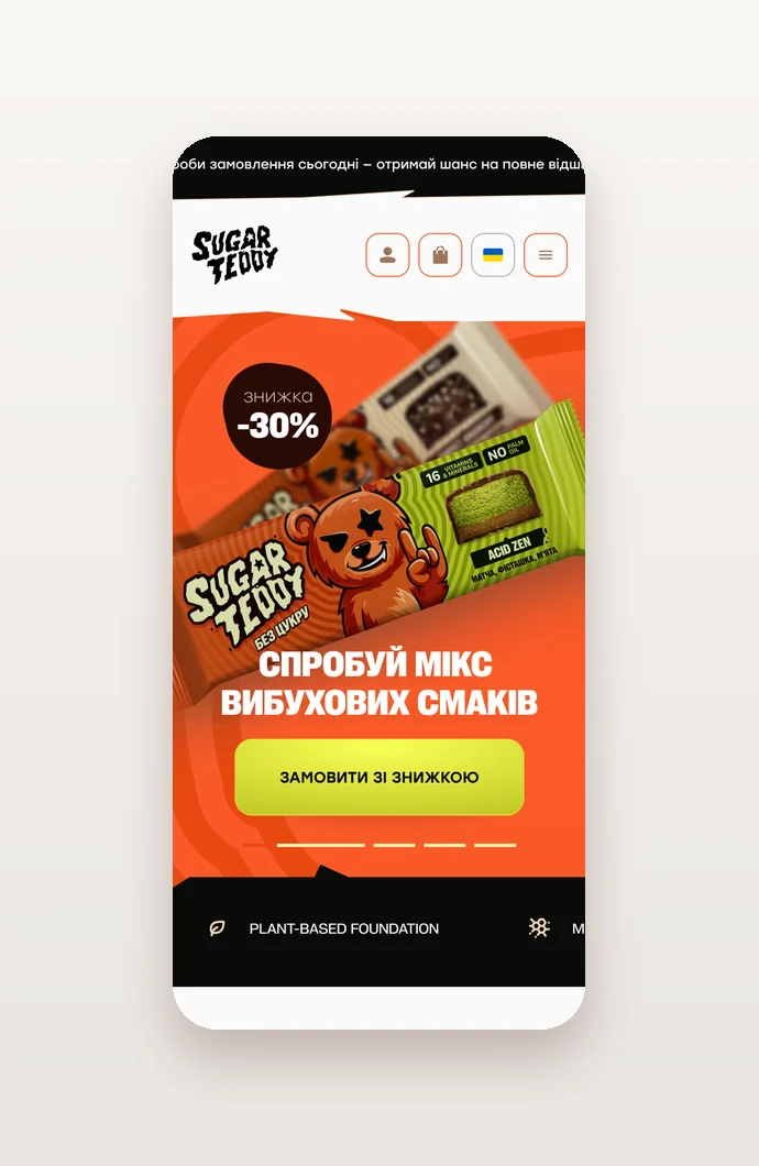
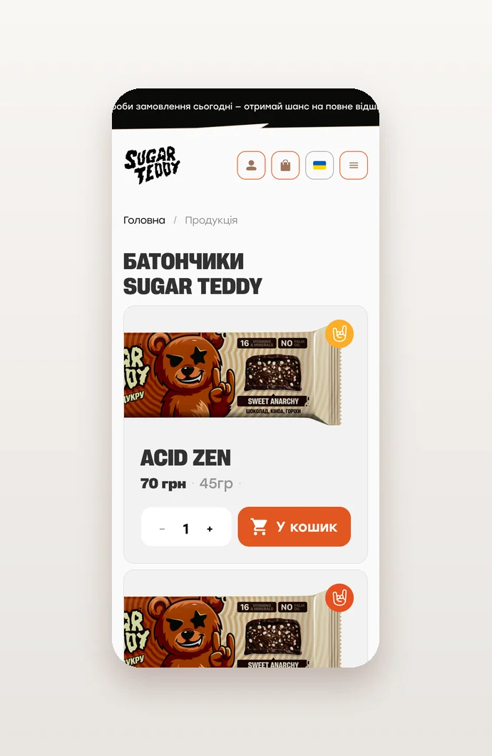
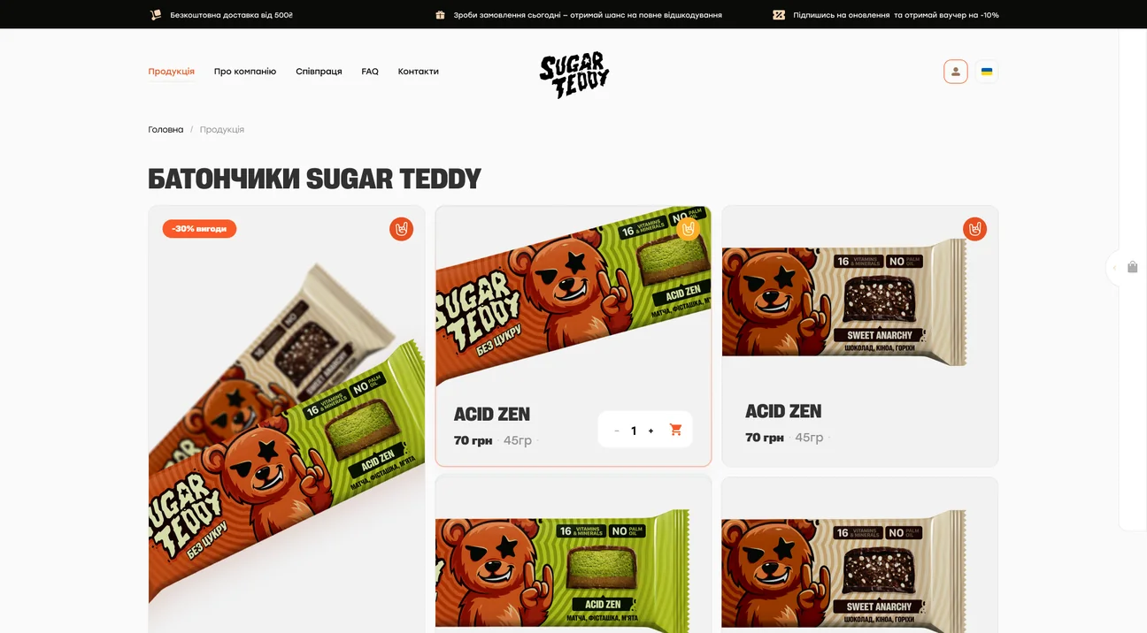
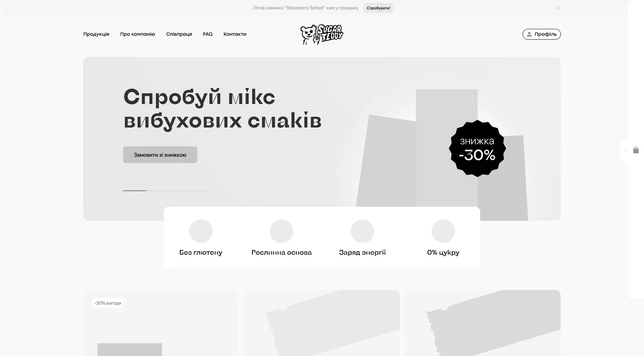
The home page opens with a mix of explosive flavours and a discount, then a running line of benefits: no added sugar, no palm oil, a plant-based foundation, minerals and vitamins, an energy boost. Every bar card has a quantity stepper and a cart button, and a flavour craziness scale tells you how far each taste goes, from a favourite classic to extraordinarily weird.
From a flavour to the order
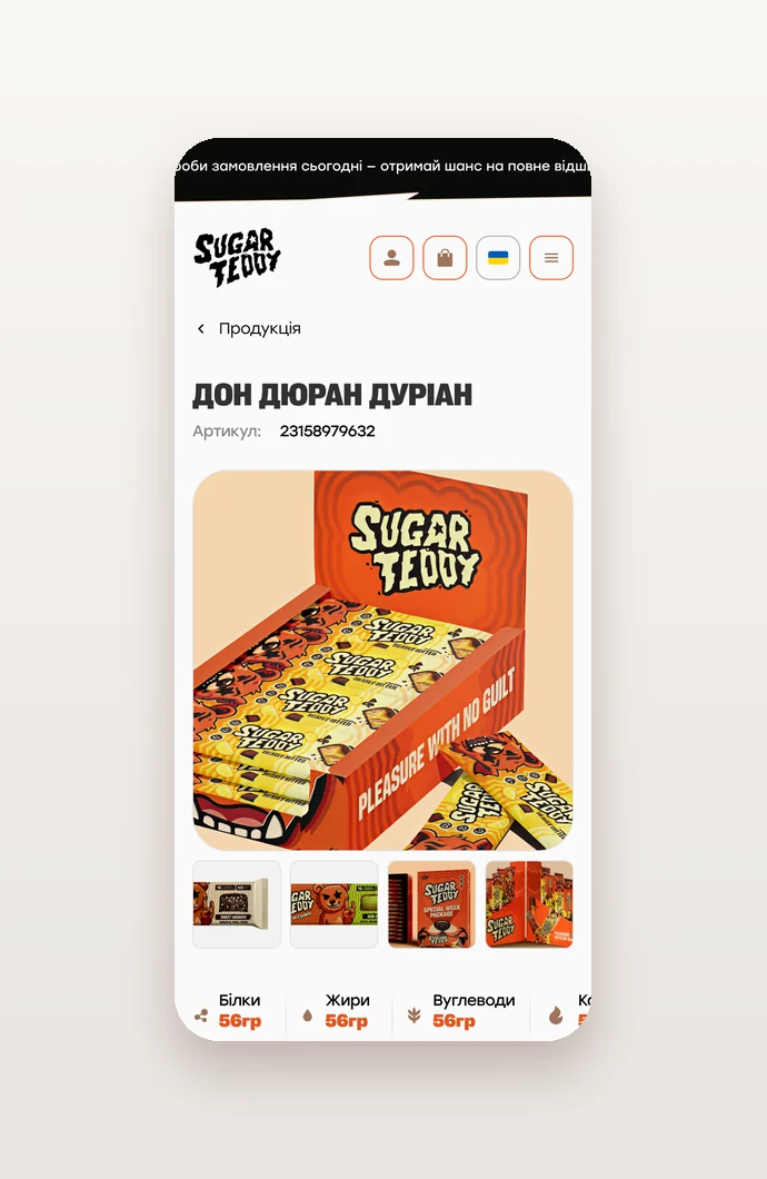
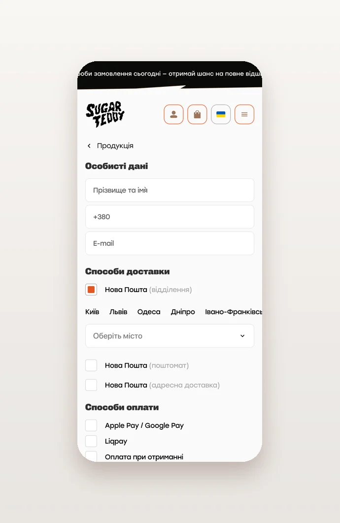
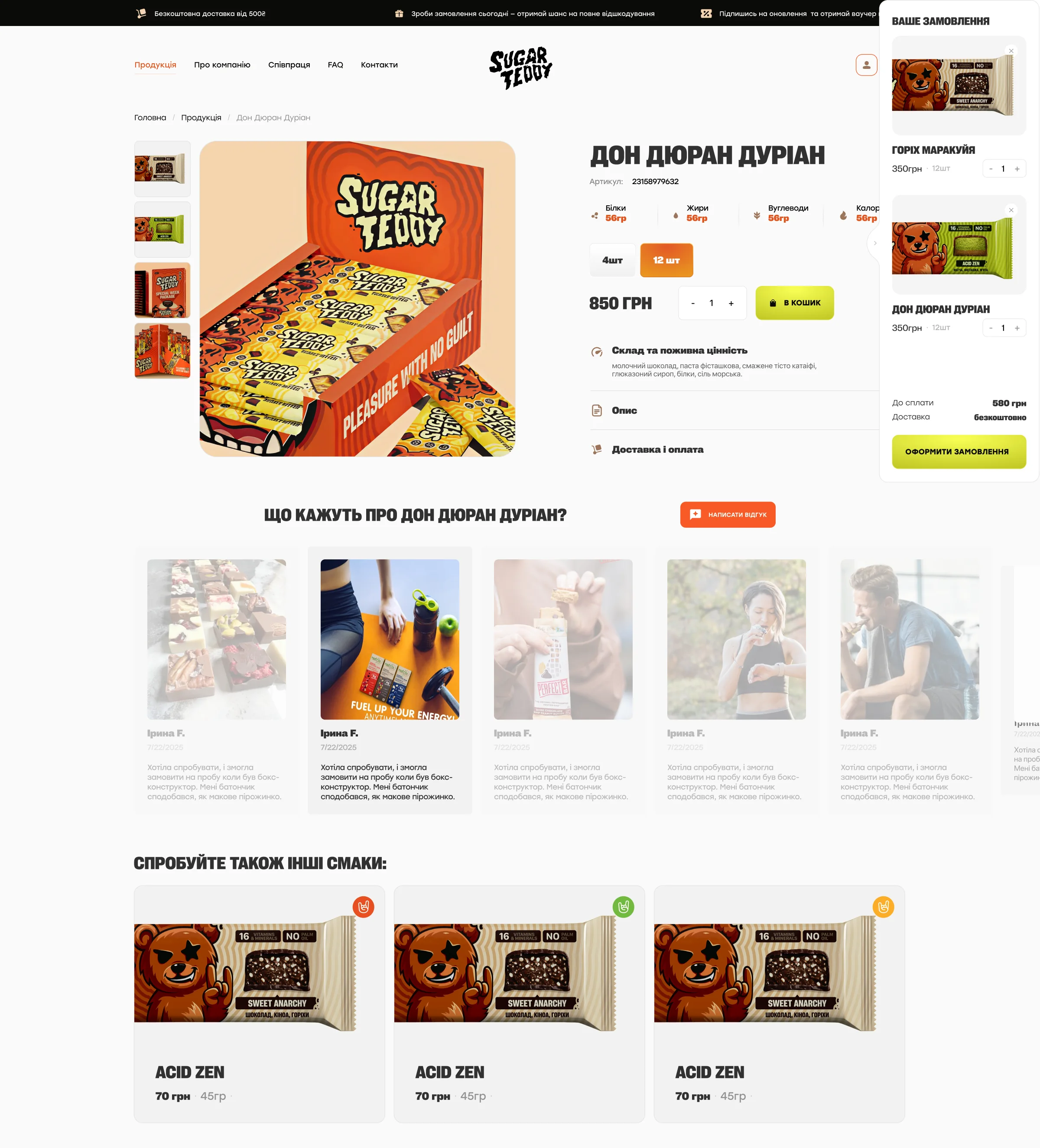
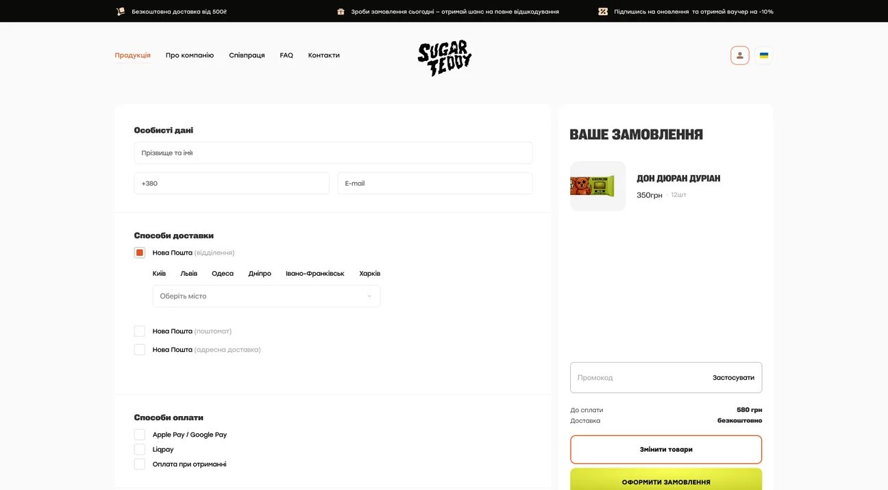
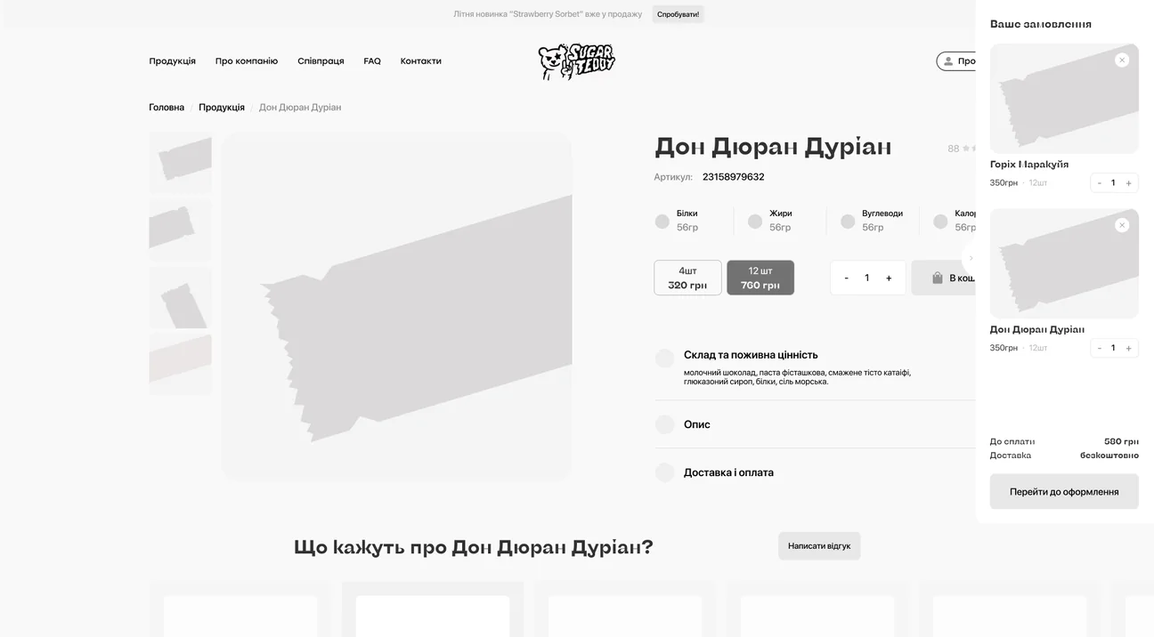
The product page shows the bar in photos with protein, fat, carbs and calories, packs of 4 or 12, and folds composition and nutrition, the description, and delivery and payment into short sections. Reviews and a write-a-review button follow, then other flavours to try. The cart slides out on the side, and checkout fits on one page: personal details, Nova Poshta delivery to a branch, a parcel locker or an address, payment by Apple Pay or Google Pay, LiqPay or cash on delivery, a comment and a promo code.
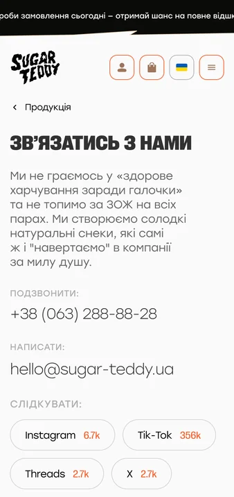
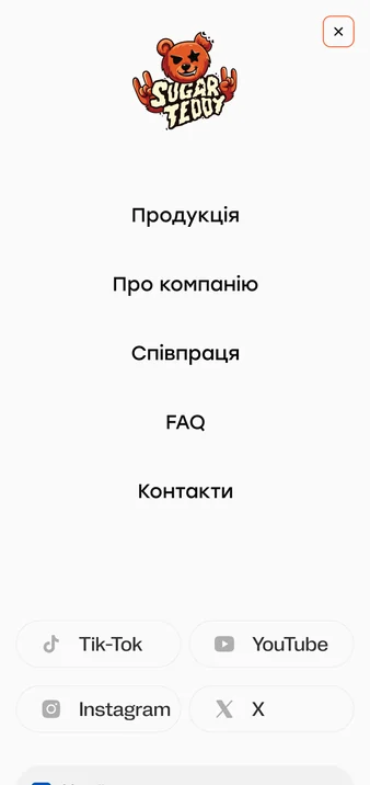
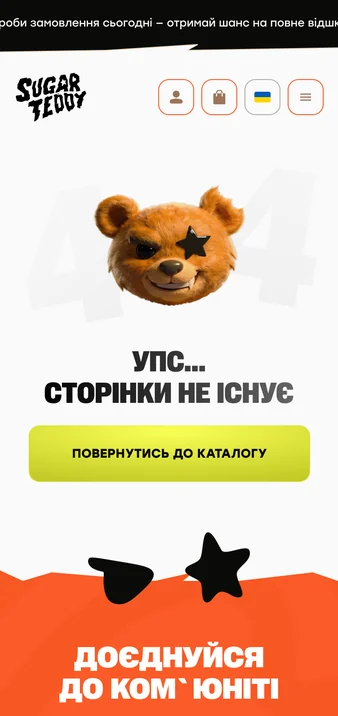
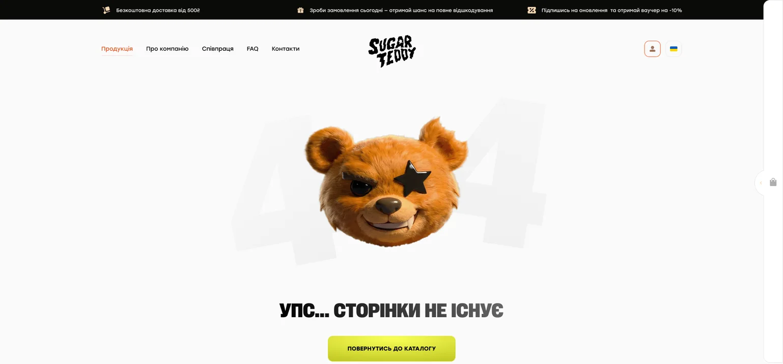
The rest of the store keeps the voice: the catalog, contacts with a form for partners, delivery and payment, returns and privacy, and a 404 page where the bear tells you the page does not exist and sends you back to the catalog. The main pages have phone layouts, with a full-screen menu, the socials and a language switch.
Wireframes first
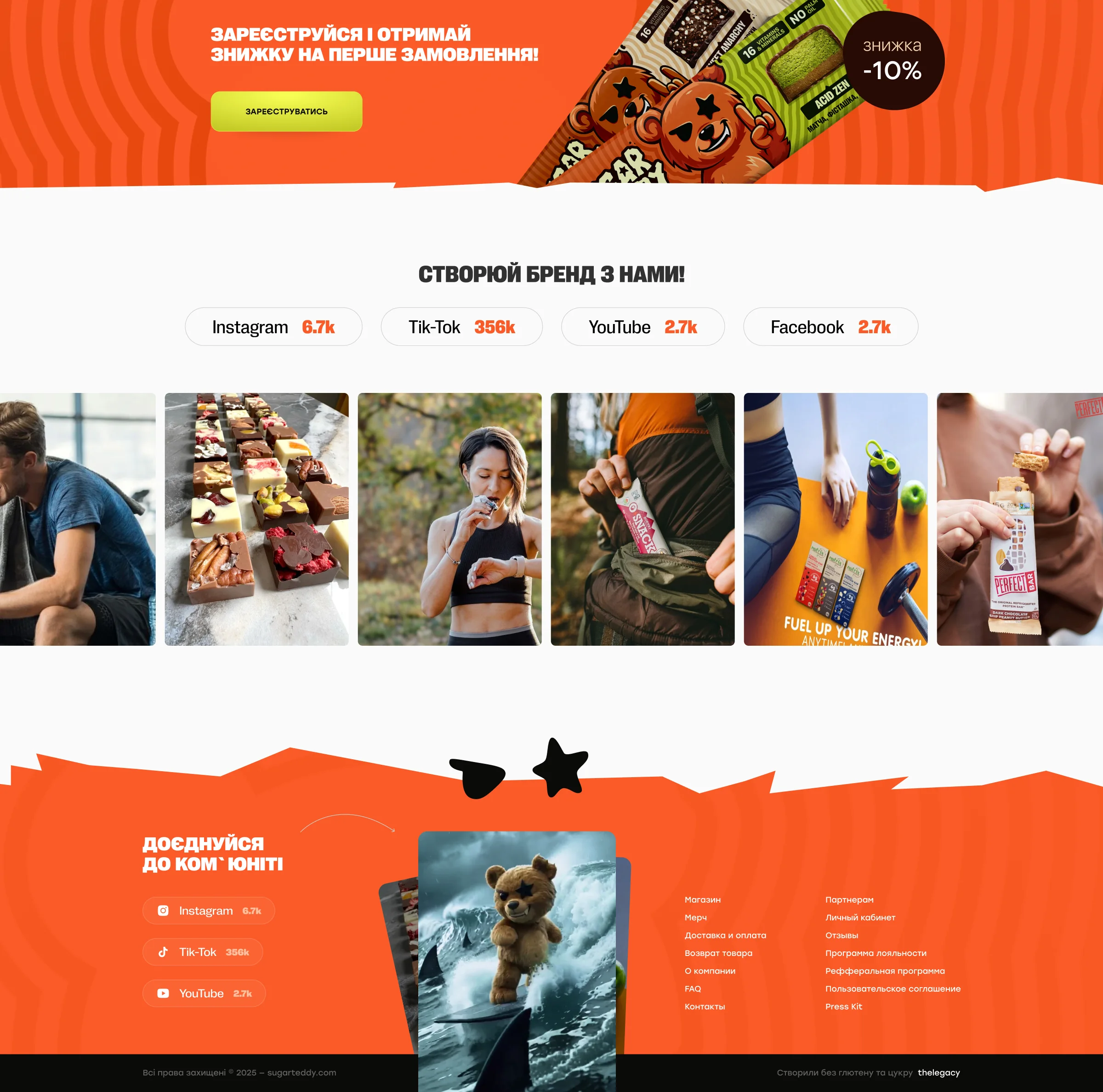
Before the orange went on, the pages were laid out as grey wireframes: the home page, catalog, product page, checkout, contacts and about page. The final home page ends with a discount for registering, an invitation to build the brand together with the community, and a footer that asks you to join it.
Project facts
- Client
- Sugar Teddy, a Ukrainian brand of sugar-free bars
- Industry
- Food, healthy snacks, e-commerce
- Platform
- Online store (desktop and mobile)
- Services
- Website UX/UI design, wireframes
- Deliverables
- Wireframes; home page; catalog; product page with nutrition, packs and reviews; cart; checkout with Nova Poshta delivery and online payment; about, contacts, delivery and payment, returns and privacy pages; 404 page; phone layouts with a full-screen menu
- More work in
- UX/UI Web Design
- Related cases
- KITCLOTHES, Cryptopinion, Growth Foundry
Questions about this project
What is Sugar Teddy?
A Ukrainian brand of sugar-free bars with no added sugar and no palm oil on a plant-based foundation, presented by a rebel bear mascot and a cheeky tone of voice.
What did thelegacy design for Sugar Teddy?
The online store on desktop and phone: wireframes first, then the home page, catalog, product page, cart, checkout, the about, contacts and policy pages, and a 404 page with the bear.
How does ordering work in the store?
You add bars from a card or the product page, choosing a pack of 4 or 12, review the order in a side cart, and check out on one page with Nova Poshta delivery and payment by Apple Pay, Google Pay, LiqPay or cash on delivery.