Crypto Landing Page Design for a Token Launch: Presale, Tokenomics and Roadmap

Crypto landing page design for a token launch comes down to these sections, in this order: the presale or buy action, how to buy with the contract address, token utility, tokenomics and vesting, a roadmap with statuses, audits, an FAQ, official channels and a disclaimer. thelegacy designed the OMINA presale page and the KWPC site this checklist draws on.
Both are part of our landing page design service, and every screen shown here is published on its case page.
What sections does a crypto landing page need?
Nine blocks cover what a buyer checks before sending money to a contract. The table lists them in the order we use, with the place where each one appears in our cases.
| Section | Question it answers | From our cases |
|---|---|---|
| First screen with the action | Is the sale live, and where do I buy | OMINA: headline next to the presale widget |
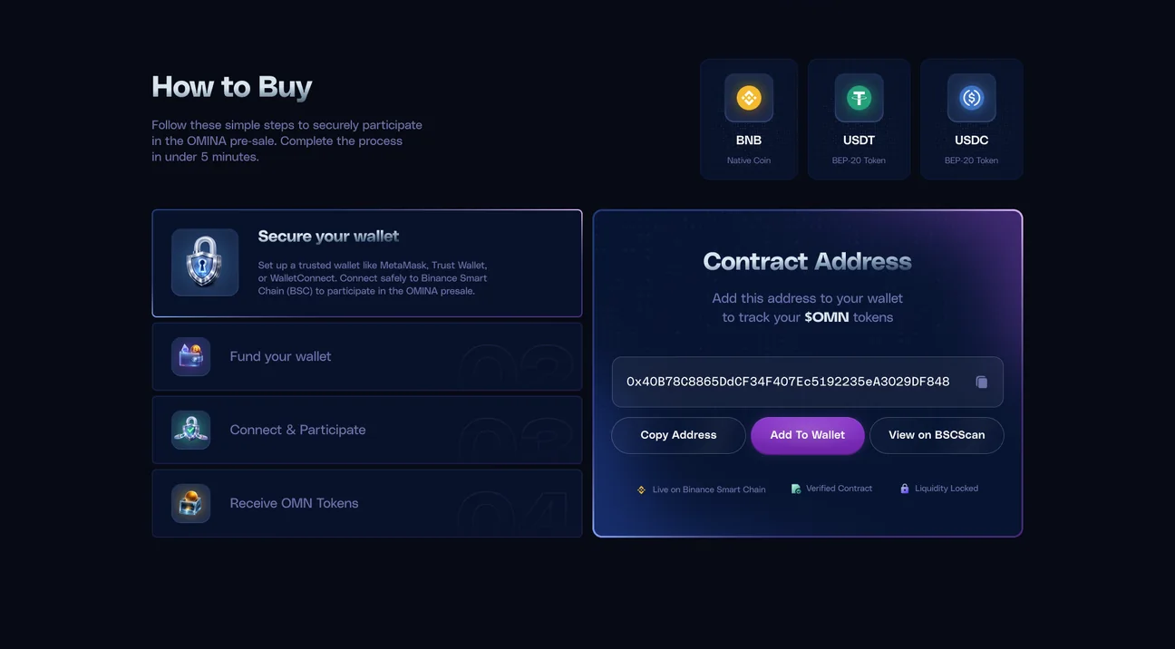
| How to buy | Which wallet and which currency | OMINA: three currencies and four steps |
| Contract address | Is this the real token | OMINA: card with copy, add to wallet and BscScan |
| Token utility | Why hold it | Catcoin: NFT purchases, governance, premium features |
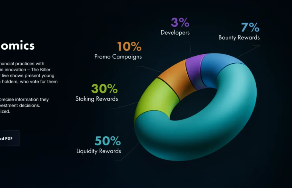
| Tokenomics | Who gets what share | KWPC: one torus in five segments |
| Vesting | When tokens reach the market | Flex: % Total Supply with Months as one curve |
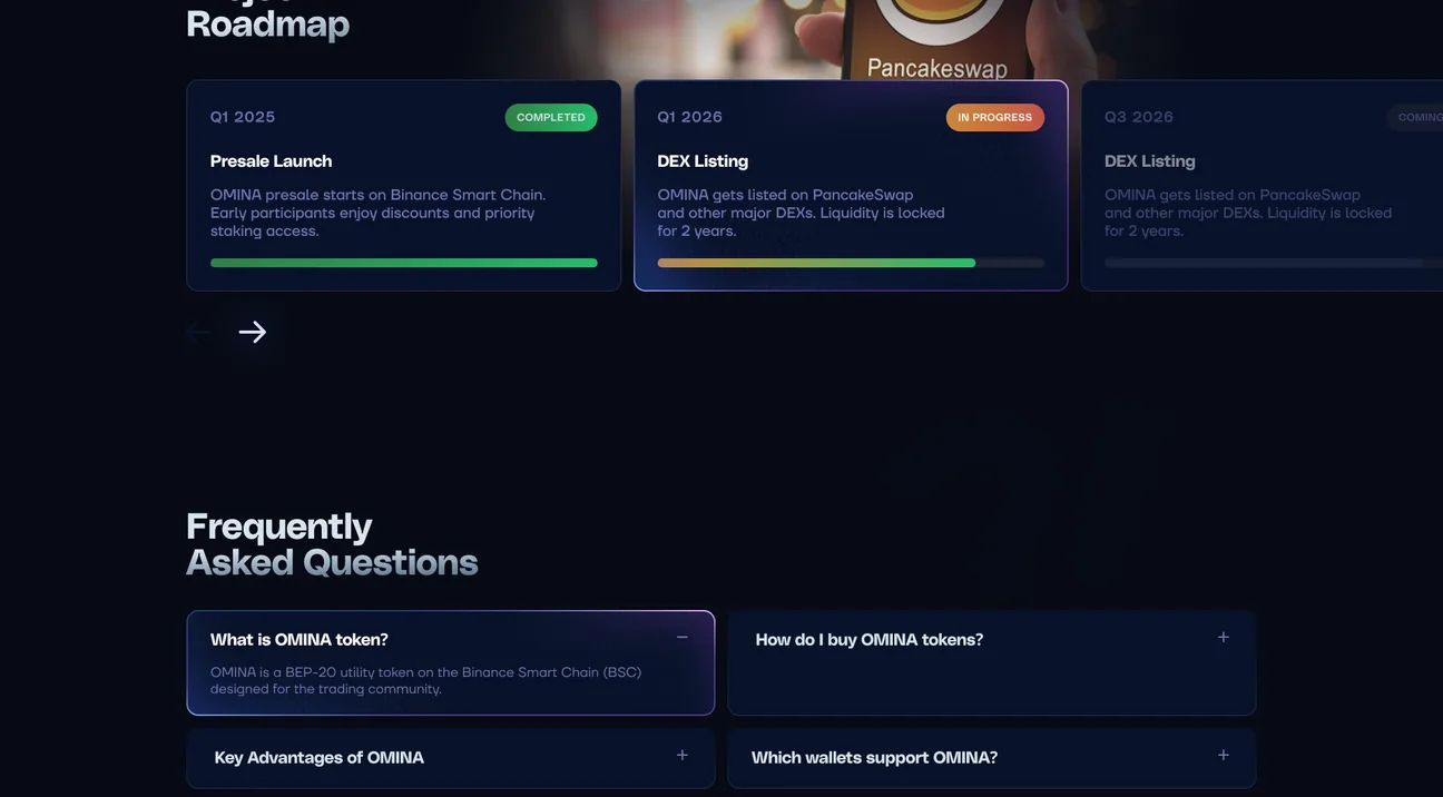
| Roadmap | What is done and what is next | OMINA: quarters with status tags and progress bars |
| Audits and FAQ | Has anyone checked the code | OMINA: audit logos under the headline, FAQ accordion |
| Channels and disclaimer | Where official news comes from | OMINA: contact email, community links, disclaimer in the footer |
What goes on the first screen of a presale page?
The sale itself. A visitor who arrives from a post or a chat wants to know whether the presale is open and what it costs right now, so the first screen should answer that before it explains anything.
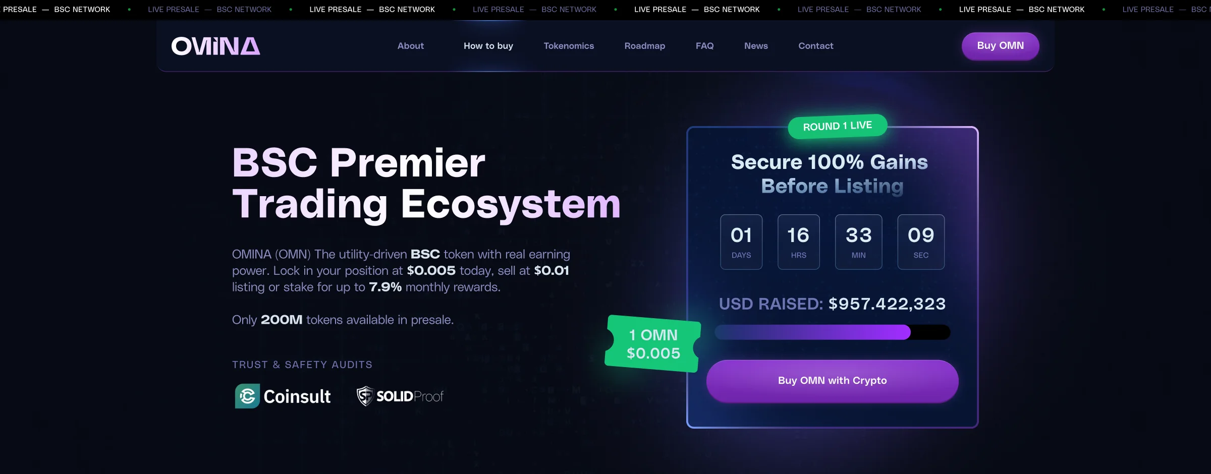
On the OMINA presale page a running line says the presale is live on BSC, and the header keeps a Buy OMN button next to links to every section. Beside the headline, the widget shows which round is running, how long until the price steps up, how much has been raised so far (with a progress bar) and a single crypto buy button. The audit logos go directly under the headline, and further down a price bar shows the price and the timer again, so the action never scrolls out of reach.
Our rule for this screen: one primary action. Staking, NFTs and partner logos can wait; a second competing button only slows the buyer down.
How do you explain how to buy the token?
As numbered steps, with the contract address right beside them. Most first-time buyers fail at the wallet or the network, not at the decision to buy.
On OMINA the block lists the presale currencies (BNB, USDT, USDC) and four numbered steps, starting with a wallet like MetaMask or Trust Wallet and ending with the tokens arriving. Beside it, the contract card offers copy, add to wallet and a BscScan link.
Catcoin tells the same steps as four comic panels for a Solana token; we described that page and the brand side of a launch in token launch branding.
How should tokenomics and vesting look on a landing page?
As one allocation chart and one schedule, never a table of twenty rows. People screenshot this block and post it elsewhere, so it has to stay readable when cropped.
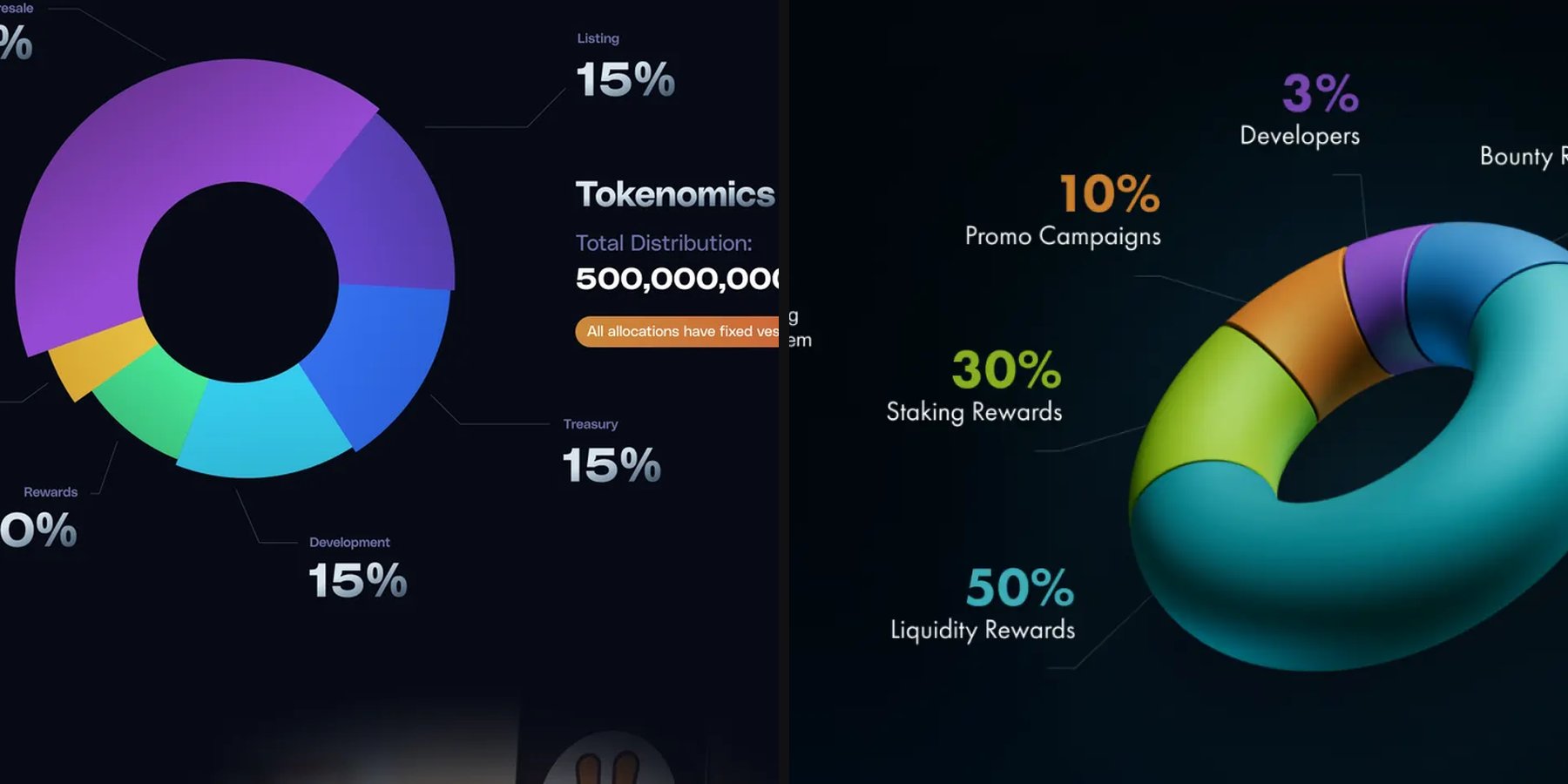
On the KWPC site the allocation is drawn as a 3D torus with five slices: liquidity rewards 50%, staking rewards 30%, promo campaigns 10%, bounty 7% and developers 3%. Every figure takes its slice’s colour, so no legend is needed, and the site’s navy and teal palette lets in lime, orange and violet only here.
Allocation and timing are separate questions. On the Flex site the release schedule is a single blue curve, % Total Supply with Months, drawn over faint gridlines.
What makes a roadmap believable?
Status. A list of quarters with promises says little; a roadmap that marks what is done, what is in progress and what is planned shows that the team updates the page.
OMINA’s roadmap runs by quarter with status tags and progress bars, and the FAQ below it is an accordion. A news feed filtered by marketing and milestones leads to a separate news post page, which gives the team a place to prove each milestone instead of just ticking it.
How does the page change on a phone?
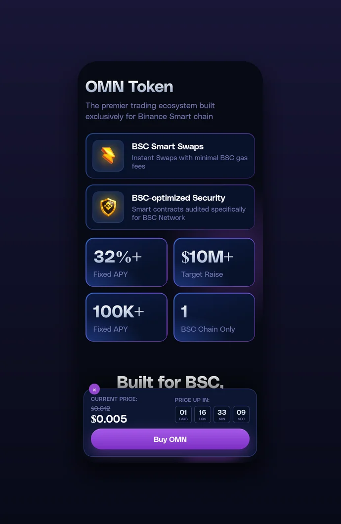
It keeps the same order, but the buy action moves to the bottom of the screen. On a phone the price and the button must stay visible while the visitor reads.
The OMINA phone version follows the desktop page section by section. Horizontal rows such as the roadmap and news turn into swipeable strips, stat cards sit two per row, the steps, contract card and FAQ go one under another, and the price bar becomes a bottom sheet holding the timer and the buy button.
KWPC does the same with data: the launch pool results, a four-column grid on desktop, fold into two columns of label and value pairs.
Where do audits, warnings and the disclaimer go?
Next to the thing they qualify. An audit badge belongs near the buy button, and a warning about lost funds belongs next to the address field.
In the KWPC wallet top-up form, the note that a transfer to a wrong address cannot be recovered sits right by the input fields. OMINA ends on contacts, community links and a disclaimer, and the footer describes the token as a meme coin and asks visitors to do their own research. The wording of a disclaimer comes from your lawyers, not from another project’s page.
What decides the scope of work for a token landing page?
The number of states and extra pages, more than the number of sections. A presale widget has rounds, a countdown and a sold-out state, and each one needs its own design.
- A live presale widget, or a static buy section that links to an exchange.
- A phone version for every section, or only for the first screen and how to buy.
- Illustration or 3D: Catcoin is drawn as a comic book, KWPC has a set of glass 3D objects.
- Extra pages such as a news post template, investor tools or a show archive.
- Wireframes first: KWPC and Flex both started as grey layouts before any colour.
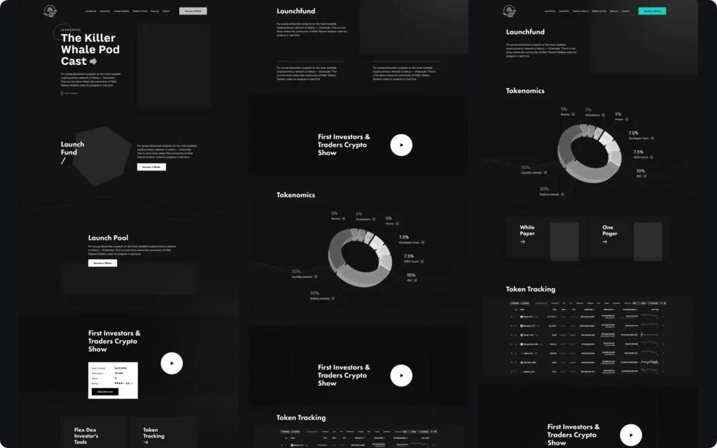
The table at the top works as a brief: mark which blocks your token already has and which states each one needs before you talk to a designer. Our token pages and the cases behind them are collected on the landing page design page.
Key takeaways
- The first screen sells one action: a presale widget with the round, a countdown and the amount raised, repeated lower down by a price bar, as on the OMINA page.
- Allocation and timing are two different charts: the KWPC tokenomics torus labelled in its segment colours, and a single release curve on Flex.
- Scope is set by states and extra pages: presale rounds, a mobile bottom sheet with the buy button, a news post template, 3D or illustration.
Frequently asked questions
What should a crypto landing page for a token launch include (presale, tokenomics, roadmap)?
A first screen with the sale, how to buy with the contract address, token utility, tokenomics and vesting, a roadmap with statuses, audits, an FAQ, official channels and a disclaimer. Order matters: whatever a buyer needs to buy sits above everything that explains the project.
Should the contract address be on the first screen?
Yes, either in the header or next to the buying steps, with a copy button. The address is the one thing a buyer must enter without a mistake, and the easier it is to copy from the official site, the fewer people look for it in chats.
Do I need a separate tokenomics page, or is a section on the landing page enough?
For a launch, a section with one allocation chart and a vesting schedule is usually enough. A separate page makes sense when the split is complex, with several rounds and unlock terms that do not fit on one screen.
Can one page serve both the presale and the time after listing?
Yes, if the buy widget is designed with several states: round live, round closed, token trading on an exchange. After listing only the buy block changes and the rest of the page stays.
What should I check on a token landing page before the presale opens?
That the contract address is correct and copies cleanly, the audit and official channel links open, the phone version shows the price and the buy button, and the disclaimer has been approved by your lawyers.