
Fintech website design has one job on the first screen: to prove, before anyone scrolls, what the product does, that it really works, who stands behind the money and what to do next. thelegacy designed fintech and crypto websites for Banxe, dEquity, Skynet Trading and ARUS. Below is how each of their first screens answers those four questions.
The website is part of our UX/UI and web design service. This article is about the public site that has to win the visitor’s trust. The screens people see after sign-up are covered in fintech app design examples.
What does the first screen of a fintech website have to prove?
Four things, in this order: what the product is, that it exists, who is responsible for it, and which step to take. A visitor who is about to hand over money or personal data runs this check in seconds, and a screen that skips one of the four leaves a question nobody is there to answer.
| What the visitor asks | What the screen has to show | How our cases do it |
|---|---|---|
| What is this, and is it for me? | The name and one line on what the product does, in words the visitor already uses | Banxe: Multifunctional trading App, then the modes: Spot, Futures, P2P, DeFi, Fiat Gateway |
| Does it actually work? | Live data or a real product screen, not an abstract illustration | dEquity: a strip of crypto prices above the headline; Skynet: a preview of the client dashboard in the hero |
| Who is behind my money? | Plain words on what the company is and does, the team, legal pages | Skynet: a disclaimer in the footer and a management section on the About page |
| What do I do now? | One main action, plus a quieter one for people who want to read first | dEquity: Create Account in orange beside an outlined Download White Paper |
The same four questions apply to a neobank website, a crypto exchange or an investment platform. What changes from product to product is which question is hardest. For an unfamiliar asset it is the first one; for a firm that touches client funds it is the third.
How do you say what a fintech product does in one line?
Name the category the visitor already knows, then list the specifics they came to look for. A clever slogan can come second; the first line has to work for someone who has never heard of the company.
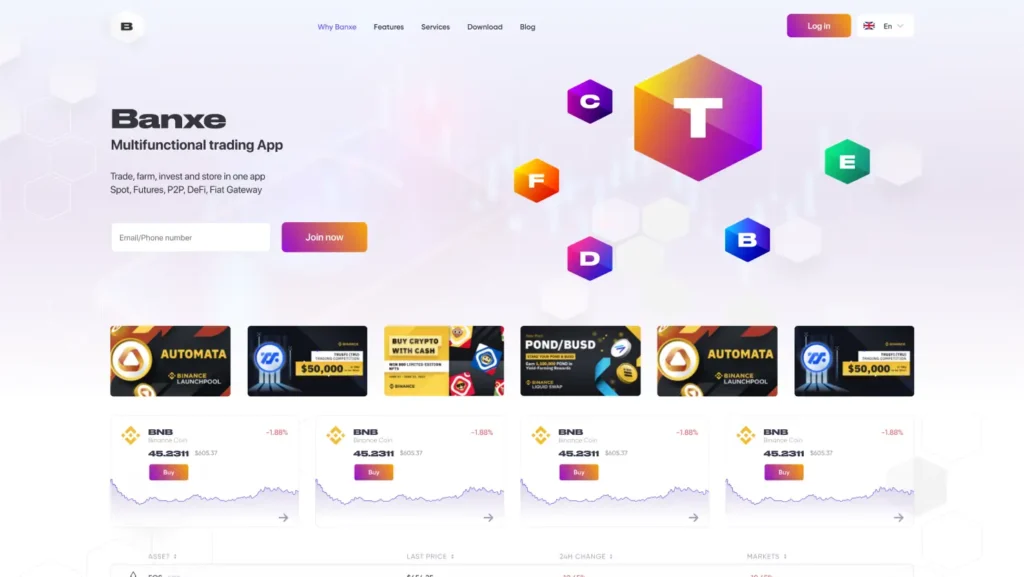
The Banxe homepage sets the wordmark in wide black type and puts Multifunctional trading App directly under it. The next line names the modes one by one: Spot, Futures, P2P, DeFi, Fiat Gateway. A trader scanning for futures or for a fiat on-ramp finds the word without opening a menu. To the right, glossy hexagon tiles lettered like the product marks float over a pale lavender ground, so the brand system is introduced on the same screen as the offer.
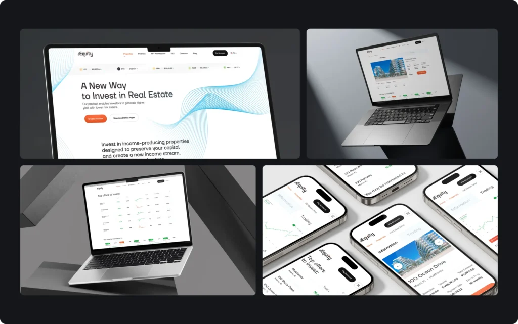
dEquity sells something less familiar: fractions of income-producing buildings, issued as tokens. Its headline does not start with tokens or NFTs. It says A New Way to Invest in Real Estate, which puts the familiar asset first and the novelty in two words. The blockchain part is explained further down, after the visitor has decided the topic is relevant.
How do you prove the product is real before sign-up?
Put something on the first screen that only a working product could show: live prices, a real list of offers or a screenshot of the actual interface. An abstract 3D shape or a stock photo proves nothing about the product behind it.
dEquity runs a thin strip of crypto prices across the top of the page, above the headline, and the first section below the hero is Top offers to invest: buildings with their yield, price and a small chart. Banxe does the same one step lower. Under the hero sit a row of promo banners and coin cards with the current price, the daily change and a Buy button, followed by a market table. The visitor sees a market before reading any claims about it.
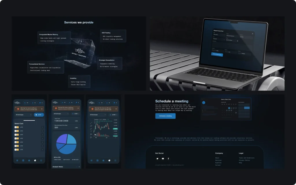
For a B2B firm, the product is often a dashboard the visitor will never see without an account. The Skynet Trading website solves this by placing five service pills directly above a preview of its client dashboard in the hero. A token issuer looking for a market maker sees the tool they would be using before reading the service descriptions.
Our design decision on all three: if the product has data, the data is the hero image. It is more specific than anything an illustrator can draw, and it changes every day, which tells the visitor the product is alive.
Where does a fintech website show who is behind the money?
In the places a careful visitor checks: the footer, the About page and the team section. The wording there should be plain enough to say what the company does and, just as important, what it does not do.
Skynet Trading leases out trading software and advises token issuers and exchanges. Its footer carries a short disclaimer in the site’s monospace type: the firm is a technology provider and advisory firm, it never takes custody of client resources and does not run market making with its own funds. Above it sit a Schedule a meeting block with a calendar and the Company and Legal links. The About page adds a Meet Our Management section with the people behind the firm.
The same logic applies to licences and partner banks. If a product works under a licence or through a sponsor bank, the disclosure belongs where the visitor makes the decision, not only in the terms of service. We cover these trust signals in more detail in fintech branding.
Which call to action should a fintech homepage lead with?
One main action in the brand’s action colour, and at most one secondary action drawn more quietly. Two equal buttons make the visitor choose before they are ready.
- dEquity uses orange only for actions. Create Account is the filled orange button; Download White Paper sits next to it as an outline, for the investor who wants to read before committing.
- Banxe starts sign-up on the first screen: an email or phone field with a gradient Join now button beside it. Log in, top right, uses the same gradient, so returning users find it at once.
- ARUS is an app, so its website sends people to the stores. App Store and Google Play buttons sit in the header next to Log in / Sign up and repeat in the About section.
The right main action follows from the business: an exchange wants an account, an investment platform may want a call or a white paper download first, and a mobile wallet wants an install.
What should the rest of a fintech homepage answer?
The situations the product is for, then the details. A list of features answers a question the visitor has not asked yet; a familiar situation makes them recognise the need.
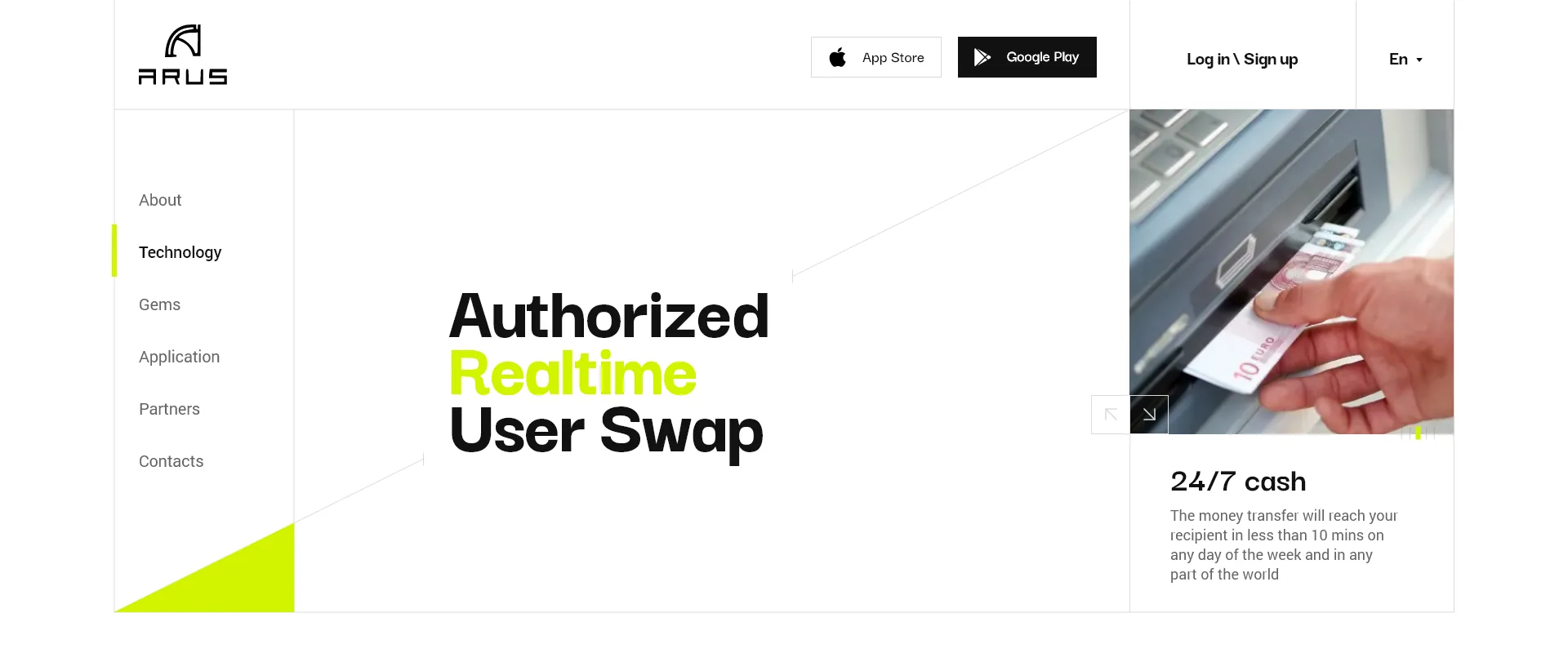
ARUS, a crypto wallet and exchange for small cash transfers, shows this well. The first screen sets the full name, Authorized Realtime User Swap, in large type, with the word Realtime in acid lime, next to a photo of a hand at a cash machine and a card headed 24/7 cash. A side menu leads to About, Technology, Gems, Application, Partners and Contacts.
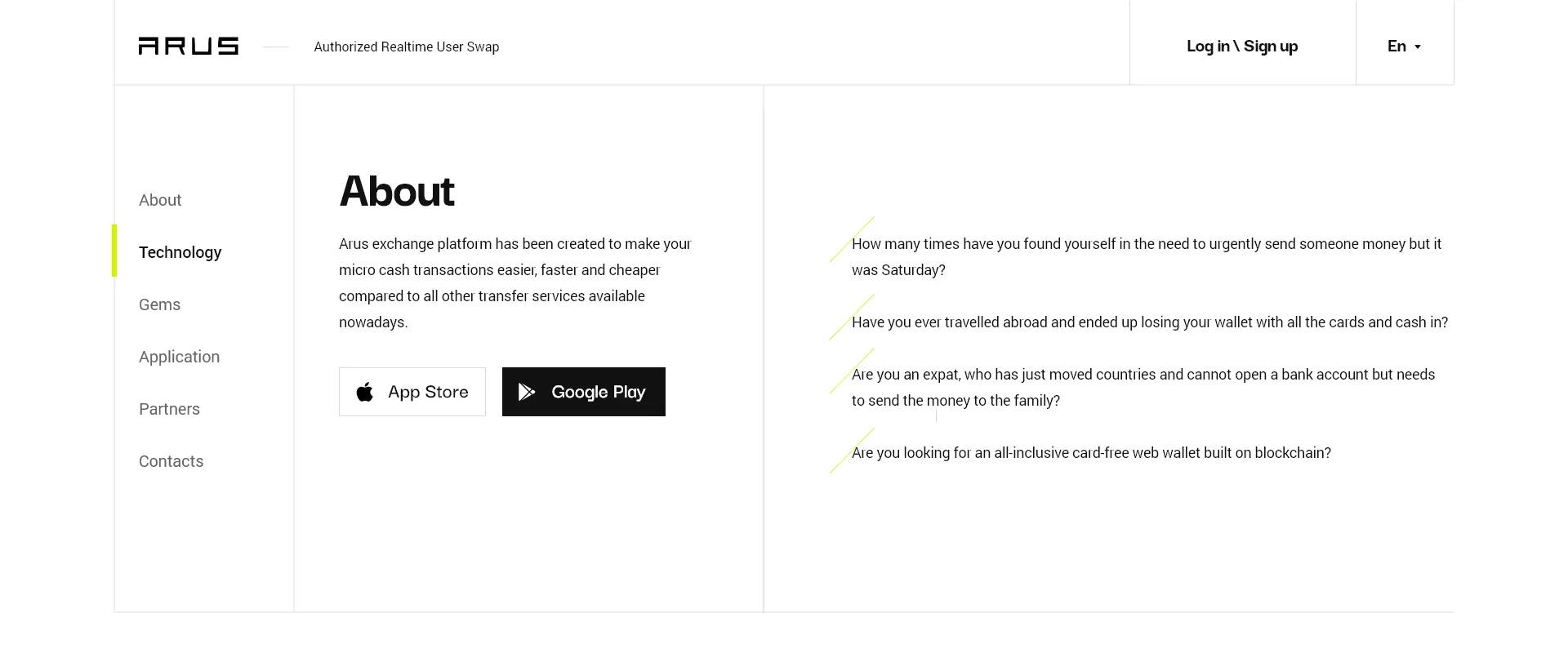
The About section skips the feature list. Instead it puts four everyday situations to the reader: money that has to reach someone on a Saturday, a wallet with every card and all the cash lost on a trip, a move abroad before any local bank account exists while family still needs support, and the wish for a blockchain web wallet with no card at all. A visitor who recognises one of them has found a reason to install the app.
Further down, a partners page takes applications in two steps, the legal representative first and the company second, so a business partner never faces one long form.
How does a fintech website work on a phone?
The order of proof stays the same; the layout collapses into one column. On dEquity’s mobile site the hero, the offers list and the property pages stack in the same sequence as on desktop, so the visitor still meets live data before the explanations. On Banxe, the core pages of the exchange were laid out again for mobile web rather than shrunk.
Check the hero at phone width first. A headline that fits on two desktop lines can take five on a phone and push the product screen and the main button below the fold.
Fintech website design checklist
- The first line under the name says what the product does in the visitor’s own words.
- Specific modes, assets or services are named on the first screen, not hidden in the menu.
- Live data or a real product screen appears in the hero or right below it.
- One main action in the action colour; any second action is visibly quieter.
- The footer and the About page say plainly what the company does and does not do with client money.
- Licences, partner banks or disclaimers appear where the decision is made, if the product has them.
- The team is shown with names on an About or management section.
- The hero is checked at phone width with the main button still visible.
If you are choosing a fintech web design agency, ask to see first screens like these and how the studio decided what goes on them. Our approach is on the UX/UI and web design service page; for the product side, read fintech UX design patterns.
Key takeaways
- The first screen of a fintech website answers four questions in order: what the product is, that it works, who stands behind the money and what to do next.
- Live data makes the strongest hero image: dEquity runs crypto prices above its headline, Banxe puts coin cards with a Buy button right under the hero.
- Trust comes from plain words: Skynet's footer says what the firm does not do with client funds, and ARUS swaps a feature list for four real situations.
Frequently asked questions
Which pages does a fintech website need at launch?
A homepage, a page for each product or service, an About page with the team, a contact page and the legal pages: terms, privacy and any licence or risk disclosures the product requires. If fees are part of the decision, they deserve a page of their own as well.
Should a fintech website use a light or a dark theme?
Either can work. The dEquity website is light while its trading interface has dark twins, and the Skynet site runs on dark navy. Choose by what the visitor does: reading and comparing offers is easier on a light page, long sessions with charts are easier on a dark one.
Should the website and the app be designed together?
Ideally yes, in one visual language. The ARUS app and website share white, graphite and acid lime, and the Banxe site, app and deck use one hexagon system. A person who installs the app after visiting the site should not feel they have moved to another company.
What should a fintech website avoid on the first screen?
Generic stock photos, claims without proof such as the most secure platform, several buttons of equal weight and an illustration where the product should be. Each of them takes the place of something that could prove the product is real.
How is a fintech website different from a regular startup website?
The visitor is about to trust it with money or identity documents, so the site has to explain who is responsible and what happens to the funds, not only what the product does. Legal and disclosure pages are part of the design, not an afterthought.