Fintech branding: how a financial brand looks credible from day one

Fintech branding is how a financial product earns trust before the first customer signs up: a colour system, type, card design, onboarding screens and guidelines that read as stable and consistent everywhere. We did this work for Banxe, a fiat and crypto platform, and Solid, a business banking app; both are shown below.
Building that kind of identity is part of our brand identity work. What follows is what we have found to matter most in fintech, and why generic brand thinking often falls short here.
How is fintech branding different from regular branding?
Most products ask a customer to try them. Financial products ask a customer to trust them with their money and personal data. That is a different contract, and the brand is part of how the product signs it.
A new user who lands on a banking dashboard or a crypto exchange is running a fast unconscious check: does this look like somewhere I can safely put my money? They are not reading the Terms of Service. They are reading the colour palette, the spacing, the weight of the headlines and the presence or absence of a physical card. Brand decisions that would be fine for a SaaS tool — a slightly unpolished icon set, an inconsistent button style, a noisy background — are disqualifying in a financial context.
At the same time, a fintech brand that leans too far towards traditional banking ends up invisible. The customer who chose a new fintech product was, at least in part, choosing away from their old bank. Looking identical to that bank is not a signal of safety; it is a signal of sameness.
| Brand element | Generic brand approach | Fintech brand approach |
|---|---|---|
| Colour palette | Chosen for energy, trend or category convention | Chosen to read as stable; green and red kept free for money in, money out and errors |
| Typography | Expressive or fashionable | Clear at data scales; numbers tabular-spaced; hierarchy readable at a glance |
| Card design | Optional; if present, a marketing deliverable | Central; the physical object that turns an app into a product customers carry and show |
| Onboarding screens | Brand-adjacent; handled separately by product | Brand touchpoint; the first extended time a customer spends with the product |
| Guidelines | Needed when the team grows | Needed at launch, when the app, cards, store listing and partner materials are made by different people |
| Trust signals | Testimonials and press logos | Licence marks, audit badges, sponsor bank disclosures, verification indicators — in the UI, not just on a marketing page |
How did Banxe tie fiat and crypto into one brand?
Banxe is a financial platform that does not separate fiat from crypto. Its product lines include IBAN accounts, SEPA and SWIFT payments, a centralised exchange for spot, margin and futures trading, P2P deals, a non-custodial wallet, DeFi staking and crypto processing for businesses. The branding challenge was to make all of that feel like one product rather than five acquired and bolted together.
The answer was a hexagon system. Five product areas — Crypto, Trading, Business, Ecology and Fiat Money — each got their own gradient, and the hexagon became the recurring shape across everything: a glossy 3D tile in the hero, a stepper in the P2P deal flow, a ring in the account analytics, a wallet icon in the tab bar. The shape carries enough meaning to unify the product without requiring every screen to explain the connection.
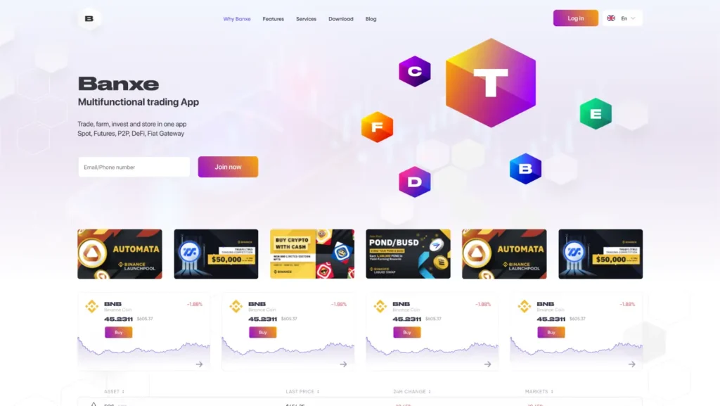
The type decision was equally deliberate. Druk Wide, wide and heavy, is set for primary headings and numbers, so balances and page titles carry the most weight. Gilroy, quieter and more legible at body sizes, takes forms and content. The pairing means a portfolio balance and a form label never compete for the same register. Colour ratio assigned 70–80% to graphite and lavender base tones, 10–20% to violet accents, and a sliver to green and red for status information.
The brand guidelines do not just document the visual decisions — they make the product legible to people who have not been in every design review. Whoever makes the next social post, card screen or deck slide works from the same document. When we wrote down the hexagon gradient rules, the type pairing and the colour ratios, we were writing the instructions for maintaining the product’s credibility at arm’s length.
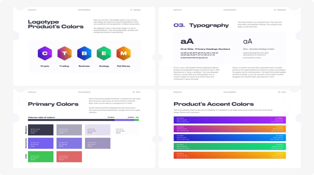
The social media templates carried the same language into a channel where consistency is harder to enforce. Each template uses the hexagon either as a structural element or as a framing device, so a post made by a content team member who was not on the original design project still looks like Banxe.
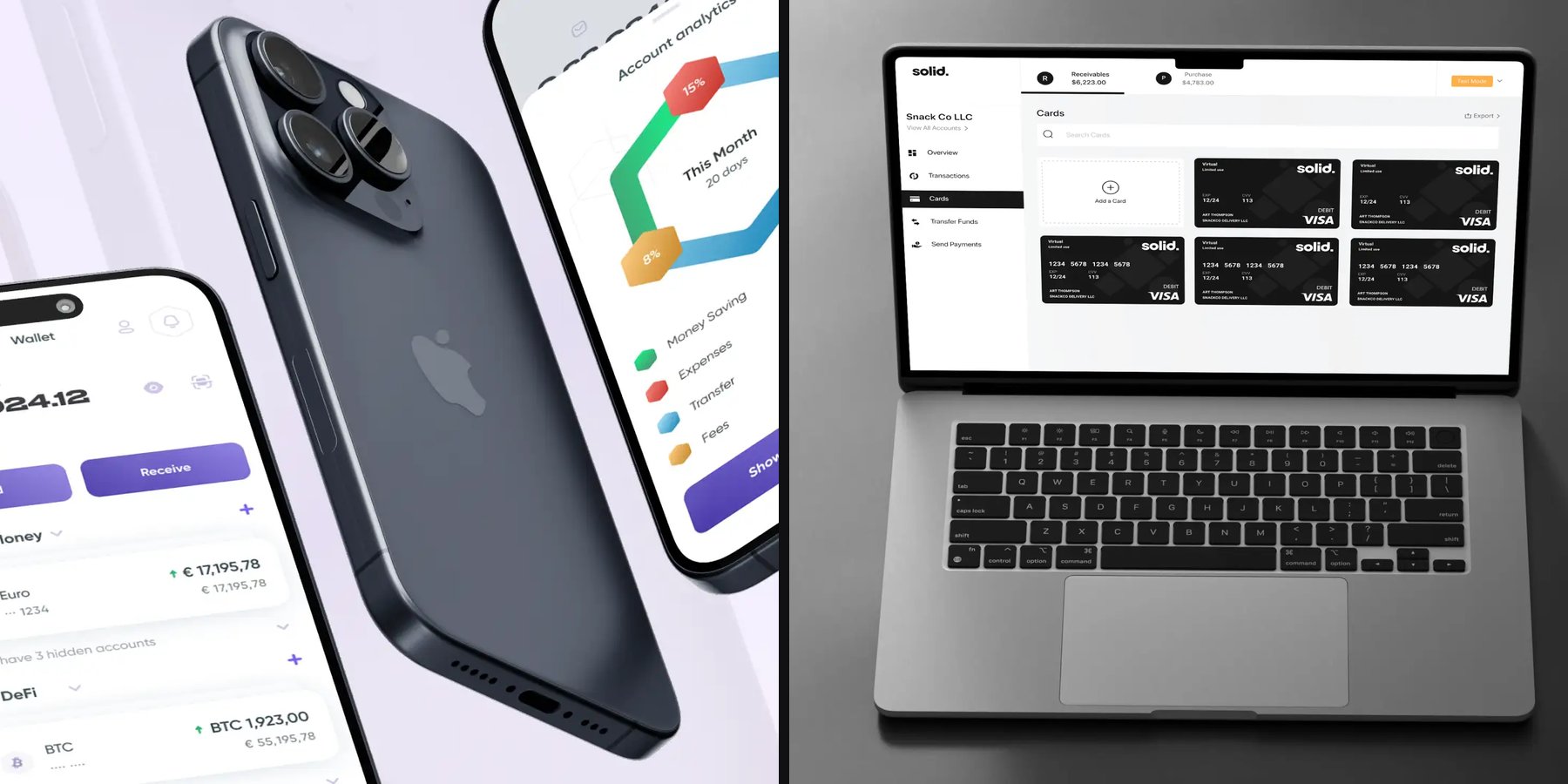
Cards are part of the same system. The cards list on the product screens holds Banxe Virtual, Banxe White and a third-party Visa card, drawn as real card faces rather than grey placeholders, so the customer sees what they will carry.
Why did Solid choose a monochrome brand?
Solid is a B2B banking platform. Its Wallet product gives businesses checking accounts, Visa debit cards and payments by ACH, wire, card and check through a sponsor bank. The customer base is operators, developers and finance teams — people who need the product to work correctly, not to delight them.
The visual system is monochrome: black and white over light grey, with avatars as initials in grey squares rather than photos. Colour appears only where it carries meaning: green for money in and completed actions, red for money out, pastel tags for payment types, orange for test mode. Decorative colour would blur those signals; a neutral base lets a balance or a failed payment stand out without a legend.
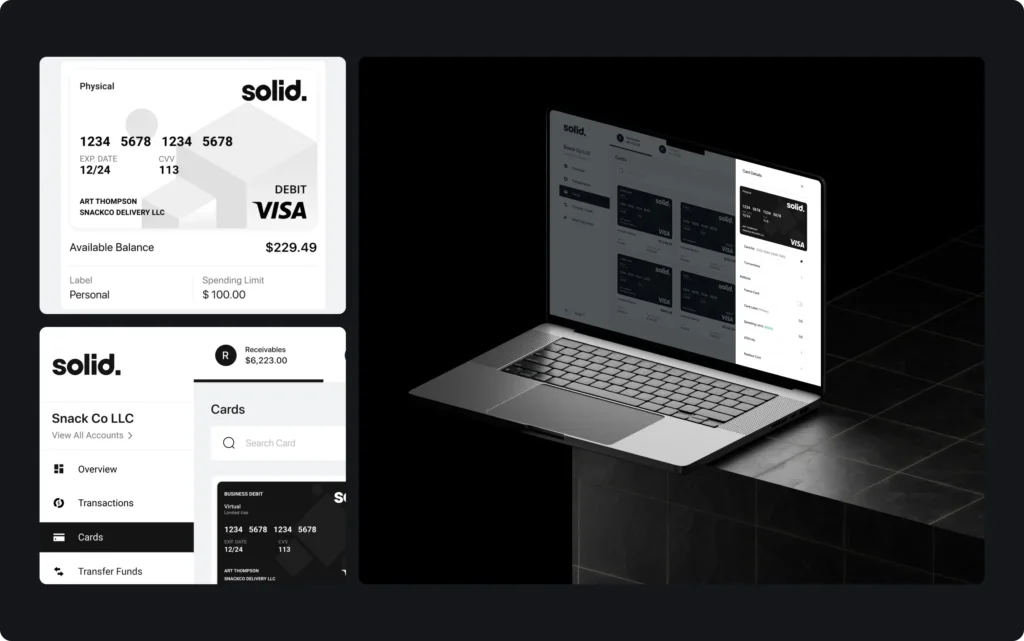
The Visa debit cards follow the same restraint. The physical card is white and grey with a black Visa mark; the virtual cards are black with the wordmark in the corner, so the two read differently in a grid. A card that looks like a tool sends a different signal than one with a lifestyle photo, and for a finance team that sees the card in expense reports, the quieter card fits.
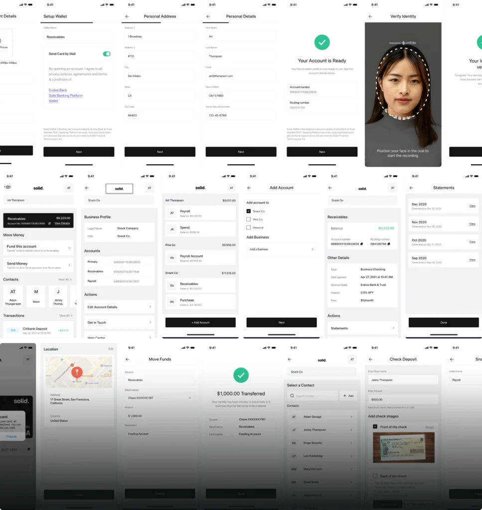
Onboarding is where the monochrome system does the most work. Each flow asks for one thing per screen. Opening an account runs through wallet setup, personal address, personal details and an identity check that frames the face in a dashed oval. Every flow ends on the same full-width black confirmation button — the same weight as a final step should feel. The consistency is not cosmetic; it tells the customer that the product was designed with care, which is the same message the card face sends.
The app sorts accounts by owner — person or company — with a subtotal per group. History is split by month, and each transaction row carries a tinted tag for the payment rail: ACH, Card, Wire or Check. Every data decision reduces the time a user spends figuring out what happened to their money. That is fintech branding doing its job at the data layer.
What should fintech brand guidelines cover?
Brand guidelines in fintech are not a creative document. They are an operational one. The moment a financial product has a card manufacturer, a sponsor bank, an app store listing, a compliance printer and a social media agency, the guidelines become the contract that keeps all of them building the same product.
What they need to cover in fintech goes beyond a standard brand book:
- Card face specifications — exact dimensions, chip position, payment network mark placement and embossing rules, in the format the card manufacturer can use.
- Regulatory mark placement — where licence numbers, sponsor bank disclosures and payment network marks appear and at what minimum size.
- UI colour semantics — which colours are reserved for status (green, red, amber) and which are decorative, so product and brand designers make the same decisions independently.
- Data typography rules — how account numbers, currency amounts, dates and reference codes are set, including tabular figure spacing.
- Dark mode behaviour — which elements invert and which stay fixed, especially for trust signals and regulatory copy.
For Banxe the guidelines fix the five product gradients, the type pair and the colour ratio, so the exchange, the app, the social templates and the pitch deck share one kit. For Solid the palette is so narrow that any deviation shows at once, which makes the rules easy to check.
Which trust signals belong in the product itself?
Trust in a financial product is not built on a landing page. It is built across the full interaction: the onboarding flow that handles identity verification without feeling invasive, the transaction history that shows exactly what happened and when, the card management screen that makes blocking and replacing a card feel straightforward rather than alarming.
Some trust signals are explicit. When a Solid customer opens an account, the confirmation screen hands over the new account and routing numbers with the sponsor bank disclosure in small print under the form: not hidden in a footer, not behind a link. On the Banxe P2P deal screen, the counterparty panel shows registration date, transaction count, rating and verification level next to the order, so the trust check happens without leaving the deal. Legal or the business decides that such information must exist; design decides where it sits and whether the user sees it before they start to worry.
Other signals are implicit. A consistent button style that never changes its text unpredictably. Account and routing numbers with copy buttons, as on the Solid funding screen. An error state that explains what went wrong in plain language rather than showing an error code. Each of these is a small signal of care, and they accumulate into a brand impression that copy and colour alone cannot produce.
This is why fintech branding starts with the product screens, not with the logo. The logo is what a customer sees for a second when they download the app. The product screens are what they live in for the duration of the relationship.
Where should work with a fintech brand agency start?
Start with two questions: what does this product need the customer to trust it with, and what does the customer already use as a reference for that kind of trust? The answers set the constraints before any visual work begins.
For most consumer fintech, the reference is a mix of existing banks and the newer apps that took their customers. For B2B fintech, the reference is the CFO or the developer who is evaluating the integration. The brand has to speak to that person’s version of credibility, not to a generic financial aesthetic.
If the product already has a brand that needs rethinking rather than starting from scratch, the questions in Rebranding: when a company needs it and how to do it without losing customers apply directly. If the product is a token or a crypto platform, some of the same principles are covered in Token launch branding: logo, ticker, guidelines and listing assets.
See the full projects in the cases Banxe and Solid, or the brand identity service page.
Key takeaways
- A financial brand builds credibility before a customer signs up: through colour, type, card design and guidelines — not only through words.
- Banxe unified fiat and crypto in one product; a hexagon system and brand gradients gave the platform a consistent identity across exchange, app and social media.
- Solid chose monochrome as the language of B2B banking: black and white over light grey, with colour kept for money in, money out and payment types.
Frequently asked questions
What is fintech branding?
It is the visual system that signals trust before a customer opens an account: a colour palette, typefaces, card design, onboarding screens and brand guidelines that keep every touchpoint consistent — from the app icon to the pitch deck.
How is fintech branding different from ordinary branding?
A financial product faces higher trust requirements than most. The customer is handing over money and personal data, so the brand has to read as stable, transparent and compliant — while still having enough character not to look like every other bank.
Why do many fintech brands use dark or monochrome palettes?
Dark and neutral backgrounds reduce visual noise, let numbers and data read clearly, and signal seriousness. They also create distance from traditional corporate blue — without requiring the brand to shout to feel distinct.
What does a fintech brand agency do?
It builds the brand identity for a financial product: the visual system, card design, product UI language, guidelines and marketing materials — with an understanding of regulatory constraints, payment network rules and the trust standards the audience expects.
When does a fintech startup need full brand guidelines?
Before the first public launch. Once the team grows or external contractors make marketing materials, guidelines are the only thing that keeps every output looking like the same product.
Does a fintech brand need a mascot or illustrations?
Not always. B2B products usually replace illustration with clear UI and data. Consumer products often benefit from an illustrative voice that makes complex financial experiences feel approachable. The choice depends on the audience and the tone the product needs.