Web3 UX Design: Wallets, DEXs and Staking Flows People Can Actually Use

Web3 UX design is the design of the moments where a crypto product asks a person for trust: connecting a wallet, picking a network, signing a deposit, reading a trade. thelegacy designs these flows for DeFi and crypto teams. Below are the patterns we used in Flex, Souq, Optix and dEquity, and the risk each one removes.
The work sits inside our UX/UI and web design service; this article is the overview, with separate deep dives on wallets and dashboards linked at the end.
What makes web3 UX different from regular app UX?
Three things. The wallet is the account, so there is no password reset; the network is a choice the user has to make; and a signed transaction cannot be taken back. Every pattern below exists because of one of these three facts.
A regular banking app can let a person explore and fix mistakes later. A DeFi app has to show cost and consequence before the signature, because after it nothing on the screen can help. That shifts the design effort from the dashboard to the in-between moments: the picker, the confirmation window, the explanation before a lock-up.
| Moment in the flow | What goes wrong | Pattern from our cases |
|---|---|---|
| First visit | The person does not know what the product wants from them | Souq: a welcome screen with one action, Connect your Wallet |
| Choosing a network | Assets sent on the wrong chain | Souq: networks as a named list, the Connect Wallet button stays inactive until one is chosen |
| Several wallets | Holdings look smaller than they are | Souq: Profile Settings lists every connected wallet with its own Disconnect button |
| Before a deposit | A lock-up surprises the user later | Souq: a five-step vault explainer; Optix: lock and fee rules in tinted notes beside the form |
| Confirming | Fees appear after the signature | Souq: every fee itemised above one confirm button |
| Landing on a DEX | The page reads like an advert, not a trading product | Flex: the trading terminal on the first screen |
| An unfamiliar asset | Jargon hides what is being bought | dEquity: buildings listed the way a broker lists stocks |
| On a phone | Wide tables do not fit | Optix: table rows become stacked label-and-value cards |
How should a web3 product ask a user to connect a wallet?
Ask for one thing at a time: first the network, then the wallet, and nothing else on that screen. In Souq, a platform for web3 game economies, the welcome screen is a neon tunnel with the Souq wordmark and a single mint Connect your Wallet button. There is no menu competing with it.
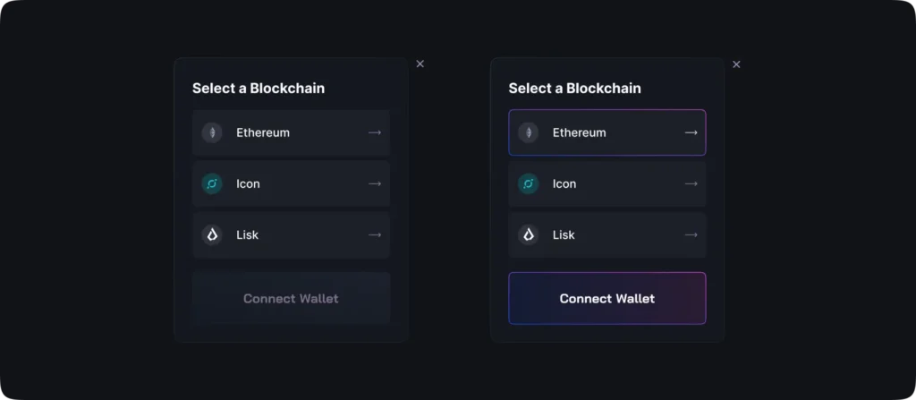
The network picker that follows lists chains by name and icon. Until a chain is selected, Connect Wallet is drawn as an inactive button; once Ethereum or another network is picked, that row and the button get the same blue-to-magenta outline. The person sees the link between the two choices without reading a word of help text.
Players of web3 games often hold items in several wallets, so Souq’s Profile Settings list each connected wallet with its own Disconnect button. The portfolio then adds them up. If a product expects more than one wallet per person, design the list of wallets as a first-class screen, not a dropdown in the header.
Crypto UI design for a DEX: what makes people trust the screen?
Show the product before the pitch. A visitor to an exchange wants proof that there is a working market behind the page, and a real terminal says that faster than any headline.
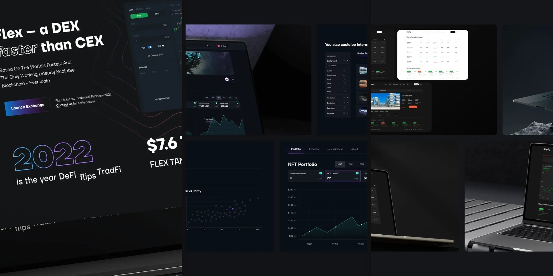
Flex is a decentralized exchange on the Everscale blockchain with a fully on-chain limit order book. On its landing page a screenshot of the trading terminal, with candles, an order book and a trade history panel, sits beside the headline on desktop and drops below it on the phone. The only decoration is a set of thin contour lines on a near-black navy ground, and the Launch Exchange button carries the gradient that later tints the charts and 3D objects.
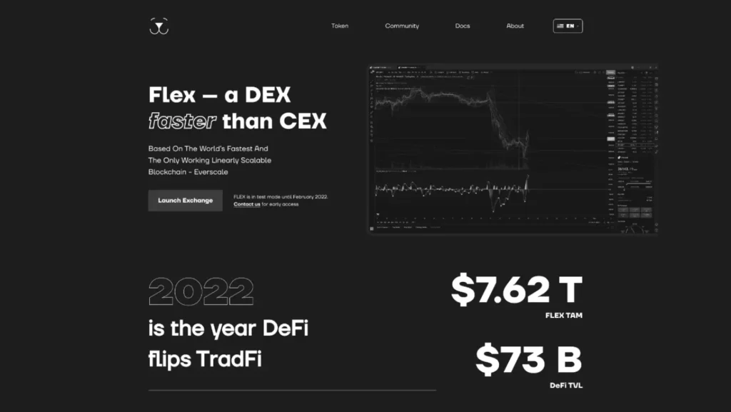
The decision we would repeat: we built the Flex page in greyscale first. Without colour to lean on, the hierarchy and the length of each block had to work on their own, and only then did the gradient go onto the one button that matters.
Trust on a centralised exchange is built differently, with people rather than code. On the Banxe P2P deal screen, a four-step stepper tracks the deal and a countdown shows when an offer cancels itself, while the counterparty panel lists registration date, transaction count, rating, verification level and a Chat button. The check on the other person happens without leaving the order.
How do you explain staking before someone deposits?
Explain the mechanism on the page where the deposit happens, in steps and in plain words, before the form asks for an amount. A lock-up that surprises someone after they sign is the fastest way to lose them.
Souq turned its time-locked vaults into a five-step carousel: deposits are made, staked token positions are created, depositors receive vault shares, rewards are distributed, and shares are redeemed when the lock ends. One diagram carries all five steps and is drawn in twelve states, so the animation shows money moving instead of describing it.
Optix, an on-chain options protocol, puts the rules right beside the liquidity form instead. Add is green, Withdraw is orange, and tinted notes next to the fields say what the person agrees to: a 14-day lock, fees earned when the pool backs traded options, and premiums released at expiry.
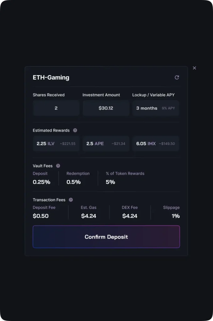
The confirmation window is the last place to repeat it. In Souq every modal of the flow follows one order, with fees listed before the button; we cover that rule in detail in the article on DeFi dashboard design.
How do you make an unfamiliar crypto asset feel familiar?
Borrow a model the person already knows and keep the new parts inside it. A tokenized building is strange; a stock table is not.
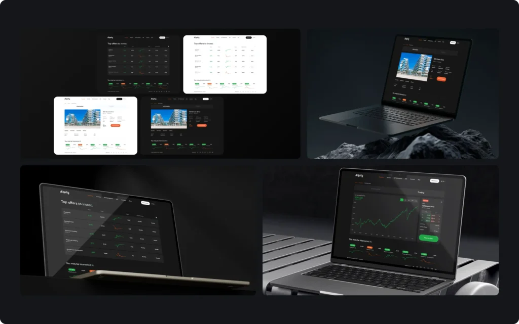
dEquity turns income-producing buildings into NFTs that trade on its own DEX. Its Top offers to invest table lists buildings the way a broker lists stocks: property type and city, yield in green, price, a sparkline, ticker, total emission and a Details button. A property page splits into Information and Trading tabs, so year built, units and yield stay apart from the price chart and the order panel.
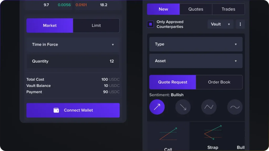
Optix does the same for options. The dashboard opens with four sentiment toggles and strategy cards such as Call, Strap and Bull Call Spread, each with a payoff sketch and one plain line. The full legs table with strike, bid and ask is still there, one step further in.
What changes in web3 UX on a phone?
The order of decisions stays; the shape of the data changes. In Optix, the New, Quotes and Trades tabs each have a mobile version in which table rows become stacked label-and-value cards. In Flex, the terminal moves below the headline instead of shrinking beside it.
Navigation needs the same care. On the Qube mobile site the four main links stay visible in a row under the logo and the Launch App button rather than hiding in a menu, because people come to a crypto platform for one of a few known places.
Checklist before you ship a web3 flow
- The first screen asks for one action, and it is the one the product needs.
- The network is chosen before the wallet, and the chosen network is visible on the next screen.
- Every connected wallet is listed and can be disconnected on its own.
- Lock-ups, rewards and their conditions are explained before the amount field.
- Every fee is shown above the confirm button, not behind an expander.
- The product (terminal, table, position) appears on the first screen of the landing page.
- Each wide table has a card version for the phone.
If you are building a wallet, a DEX or a staking product, the UX/UI design service page shows how we work. Go deeper with web3 wallet UX and DeFi dashboard design, or compare studios in how to choose a web3 design agency.
Key takeaways
- Web3 UX is shaped by three facts: the wallet is the account, the network is the user's choice, and a signed transaction cannot be undone.
- In Souq the Connect Wallet button stays inactive until a network is chosen, and both share one outline, so the link between the two choices needs no help text.
- Lock-ups and fees are explained where the deposit happens: a five-step vault explainer in Souq, tinted rule notes beside the Optix liquidity form.
Frequently asked questions
What is web3 UX design?
It is the design of how people use decentralised products: connecting a wallet, choosing a network, signing transactions, depositing into pools and reading on-chain data. The difference from regular UX is that mistakes are usually irreversible, so cost and consequence have to be clear before the signature.
Who should design the UX of a web3 product?
A product designer who has already worked through wallet connection, signatures, network choice and transaction states. Marketing pages can be designed by anyone with a good eye, but the flows that move money need someone who knows where they break.
Does a web3 product need its own wallet?
Not always. Many products, like Souq, connect the wallets people already have and list them in the profile. A product needs its own wallet when holding and sending assets is the product itself, as in a wallet app.
What is the most common web3 UX mistake?
Showing the cost or the lock-up of an action only after the user has signed it. Because a signed transaction cannot be undone, anything learned after the signature turns into a complaint instead of a decision.
How do you test web3 UX before launch?
With a clickable prototype that includes the in-between states: network choice, pending and failed transactions, success screens. The design should be checked on a phone as well, because wide tables and long addresses break there first.