Token launch branding: logo, ticker, guidelines and listing assets

Token launch branding comes down to a short list that must exist before the first buyer: a coin-icon mark, one spelling of the ticker, colour and type guidelines, a landing page with the contract address, a tokenomics chart and the logo files exchanges request. The checklist draws on Catcoin, Qube, Optix and Flex, designed by thelegacy.
We build these kits as part of our brand identity work. This guide is the order we follow, so you can run it with any team.
What does a token need before launch?
A token needs fewer assets than a company, but it needs them on day one, all at once. People meet it in a wallet list, on a chart, in a chat and on the landing page within minutes, and every place has to say the same name.
| Asset | Why it matters at launch | Check before launch |
|---|---|---|
| Mark and coin icon | The icon is what people see next to the price in wallets and on trackers | Readable at icon size on dark and light backgrounds; a round version that fits a coin |
| Ticker and name | Buyers search by ticker; a ticker set in random fonts looks like a copy | One spelling everywhere, set in the brand typeface |
| Brand guidelines: colour and type | Charts, buttons and social posts are made by different people in launch week | Two or three main colours, one headline and one text face, written down |
| Landing page | The first place people check the token is real | Contract address with a copy button, how to buy, tokenomics, roadmap, links to audit and documents |
| Tokenomics chart | Allocation is the most screenshotted block of a token site | Same colours in the site, the deck and social posts; labels without a separate legend |
| Character or 3D objects | Abstract mechanics such as staking or voting need something to look at | One visual family, so every new picture looks related |
| Listing and social files | Exchanges, trackers and wallets each ask for their own set | Square logo files in several sizes, a banner, profile pictures; check each platform’s current request form |
| Investor deck | The same story told to funds and partners | Built from the same kit as the site, not as a separate design |
How should a token logo work as a coin icon?
Design the mark so it survives being shrunk into a circle next to a price. If the logo needs its wordmark to be recognised, it will fail in a wallet list.
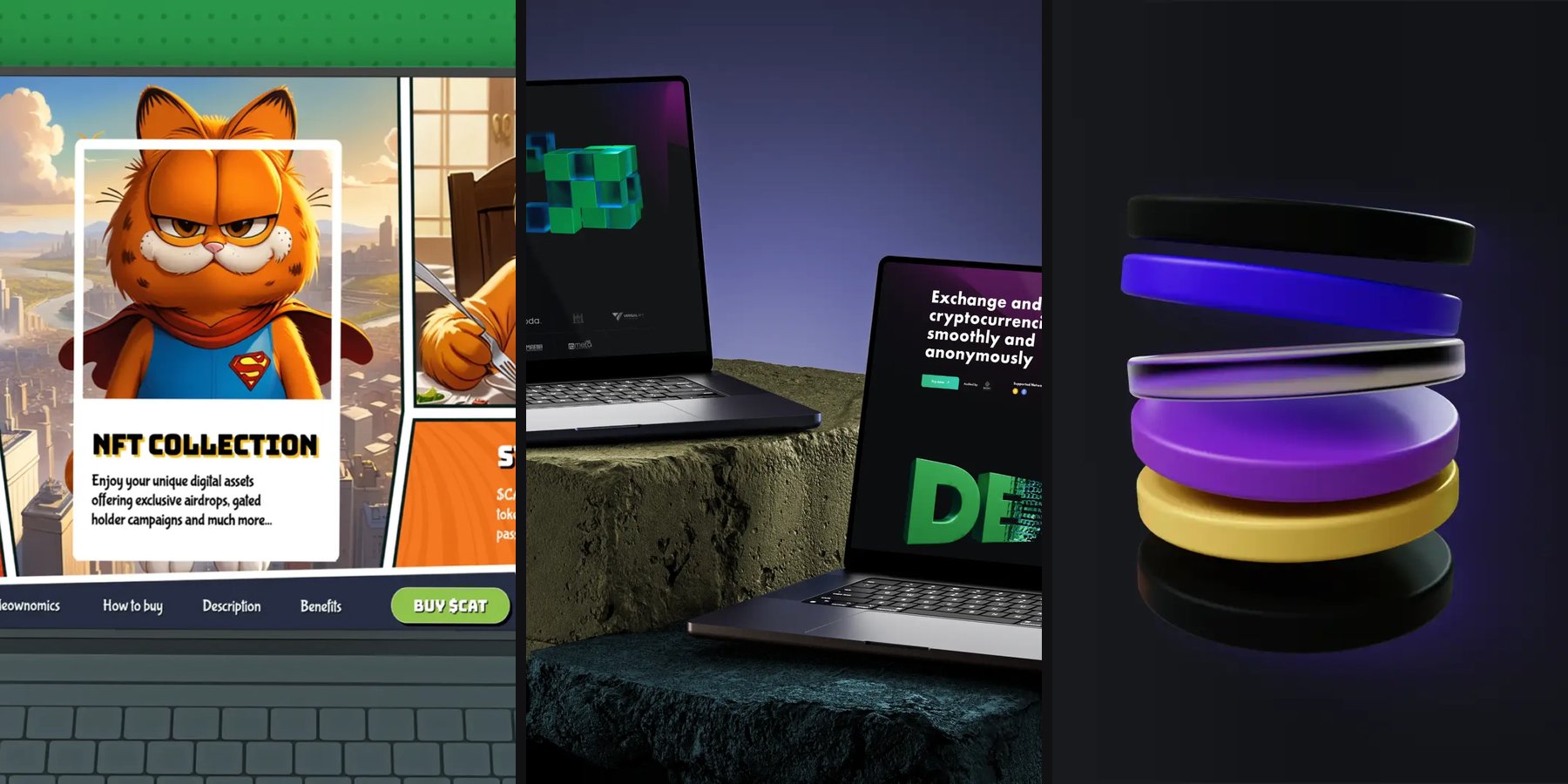
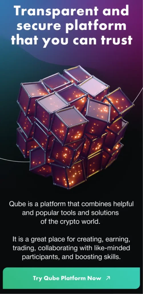
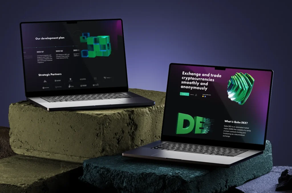
The Qube mark is a cube drawn in green outline. We took that cube and made it the recurring object of the whole brand: a block of glass cubes in the hero, a stepped stack for the development plan, and a dark coin in orbit rings for the QUBE token itself. Because the shape is so simple, it works as a flat icon and as a 3D render, and people learn one form instead of several.
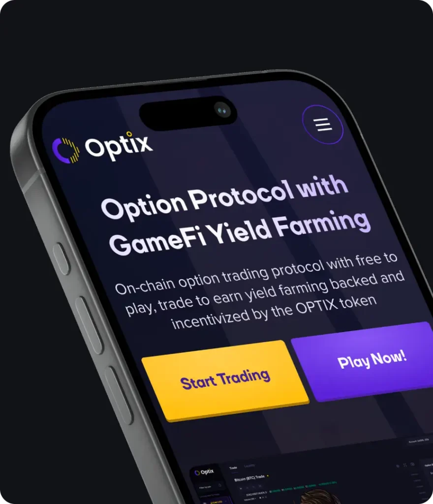
For Optix we tied the brand colours to actions. The mark is a violet arc beside yellow bars, so the landing page gives each audience a button in one of those colours: a yellow Start Trading for traders and a violet Play Now for players of its trade-to-earn game. The logo then explains the product split without a word.
What should the token landing page show first?
The first screen should answer two questions: is this the real token, and how do I buy it. Everything else, from the roadmap to the NFT plans, comes after.
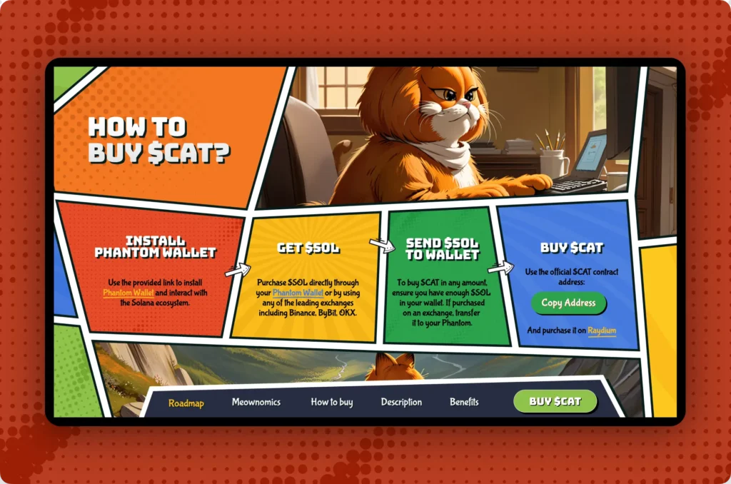
On the Catcoin landing page, a cat-themed meme token on Solana with the ticker $CAT, the contract address with a Copy button runs along the top bar. Our reasoning was simple: the address is the one thing a buyer must get right, and if the official site makes it easy to copy, fewer people will copy it from a random chat. The buying guide follows as four panels, Install Phantom Wallet, Get $SOL, Send $SOL to Wallet and Buy $CAT, joined by hand-drawn arrows, with a Copy Address button and a link to Raydium in the last one.
Qube put trust signals in the same first screen: an audit mark and a Based on Sharia Law label next to the headline, and a footer that links to the whitepaper, tokenomics and audit report. For a launch, these links matter more than any illustration.
How do you design tokenomics people can read?
Use one chart and let colour do the labelling. Allocation is the block people screenshot and share, so it should stay legible when cropped out of the page.
The Flex tokenomics block is a single donut with a strict colour key: orange for the two farming pools at 46.5%, blue for the team at 32.5%, teal for early investors and partnerships at 11% and purple for the reserve fund at 10%. Every percentage is set in the colour of its slice, so the chart needs no separate legend. On mobile the figures wrap around the donut and the explanation of the liquidity pool moves underneath.
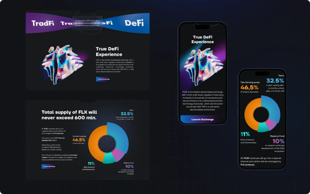
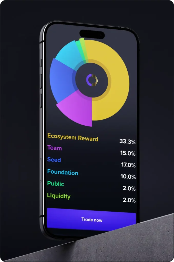
Optix uses the same idea on a phone: the donut carries the logo in its centre and each line of the allocation list is set in the colour of its slice, with a Trade now button at the bottom.
Catcoin, a meme token, kept its numbers in the comic style: Meownomics splits supply, taxes and market cap into separate panels around a WOW burst. Tone can change with the project; the rule of one fact per panel stays.
Does a token need a mascot or 3D objects?
It needs something to look at when the product is abstract. A character suits a community token; a set of objects suits a protocol. Either way, it should be one family, so new pictures for every update look related.
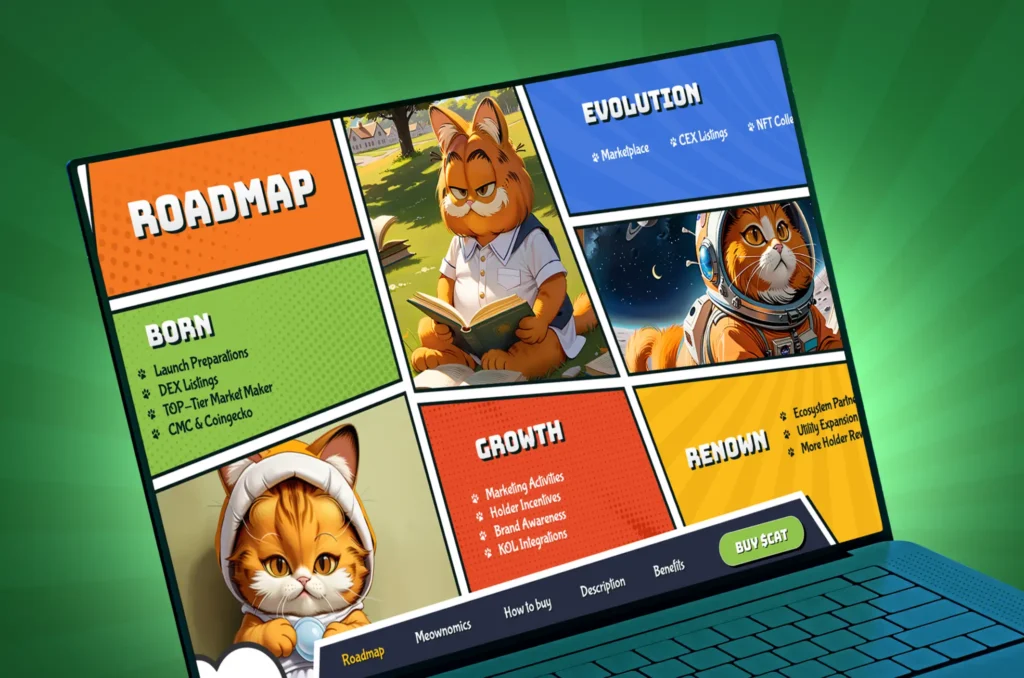
Catcoin’s whole page is carried by one cat character: in a green suit in the hero, and at a different age for each roadmap phase, a kitten in a hood for Born, a student reading on the grass for Growth and an astronaut for Evolution. Optix went the other way for its protocol mechanics: a stack of floating discs for staking, a white and blue rocket for boosting and a frosted glass ballot box for voting, all lit in violet and blue. Fozeus, a SocialFi network with its own FZS token, turned the astronaut from its logo into NFT characters on one shared body, which is what let the series be generated in the thousands.
What assets do exchanges, trackers and wallets ask for?
Each platform has its own request form and its requirements change, so read the current form of every place you plan to apply to before the design is final. From the brand side, prepare one set of source files and export from it.
- Square logo files of the coin icon in several sizes, on a transparent background, plus a version on a solid colour.
- Name and ticker spelled exactly the same as in the contract and on the site.
- Links in one place: website, contract address, whitepaper or docs, audit, social accounts. The landing page footer is a good source of truth.
- Social kit: profile picture, banner and post templates in the brand colours.
- A short description of what the token does, the same wording as on the site.
Token launch branding checklist
Run this list a week before launch. If an item is missing, it will be made in a hurry by whoever is free that day.
- The mark reads at icon size, on dark and light, in a circle.
- The ticker has one spelling and is set in the brand typeface.
- Colour and type rules fit on one page and the team has it.
- The landing page shows the contract address with a copy button, how to buy, tokenomics, roadmap and links to audit and documents.
- The tokenomics chart uses brand colours and reads without a legend.
- A character or object family exists for posts and updates.
- Listing files are exported from one source and match the current request forms.
- The investor deck uses the same kit as the site.
If the token is part of a company that already has a brand, start with what to keep; we wrote about that in Rebranding: when a company needs it and how to do it without losing customers. If you are choosing who will design the kit, the questions in How to choose a web3 design agency apply here too.
Where to start with your token’s brand?
Start with the mark as a coin icon and the first screen of the landing page; everything else is built from those two. See the full projects in the cases Catcoin, Qube, Optix and Flex, or our brand identity page.
Key takeaways
- A token needs fewer brand assets than a company, but all of them on launch day: a mark that reads as a coin icon, one spelling of the ticker, a landing page, a tokenomics chart and listing files.
- The first screen of a token site answers two questions: is this the real token, and how do I buy it.
- Export every listing and social file from one source, and check each platform's current request form before the design is final.
Frequently asked questions
What is token launch branding?
It is the brand kit a token needs before its first buyers: a mark that works as a coin icon, the ticker set in the brand typeface, colour and type rules, a landing page with the contract address and a buying guide, a tokenomics chart, social templates and the logo files exchanges and trackers request.
Is crypto branding different from ordinary branding?
The principles are the same, but a token is seen in places a company rarely is: tiny icons in wallet lists, price charts and community chats. That is why the coin icon, the ticker and the contract address get more attention than in a usual brand book.
When should a token's branding be ready?
Before the first public announcement. Launch week is when charts, posts and listing requests are made by many people at once, so the rules and source files have to exist by then, or each person will improvise.
Should a meme token look different from a protocol token?
The tone can be completely different, from a comic cat mascot to restrained 3D glass, but the basic rules stay: a recognisable icon, one spelling of the ticker, an easy-to-copy contract address and a readable tokenomics chart.
Do I need a whitepaper and an audit link on the landing page?
If they exist, yes. Links to documents and an audit report are among the first things careful buyers look for, and placing them in the first screen or the footer of the official site saves them from searching in chats.