Fintech app design examples: payments, investing, lending and banking

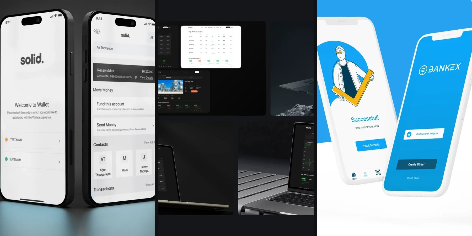
The main types of fintech are payments, investing, lending and banking, with insurance often named as a fifth. There is no official list: a 2021 study in Future Studies Research Journal proposes nine categories. Below are fintech app design examples for each type, on screens thelegacy designed for Solid, Banxe, BANKEX and dEquity.
Every type puts a different number on the first screen, and that choice drives the rest of the fintech app design. The table shows which.
Fintech app design examples: what are the main types of fintech?
For product design, four types cover most apps people use: payments, investing, lending and banking. The 2021 taxonomy by Caciatori Jr. and Cherobim splits the field more finely: Payments and Transfers, Exchange, Lending, Insurance, Investments, Advice, B2B, Digital Banks and Others. Real products often sit in several boxes at once.
| Type | The user’s first question | What the first screen shows | Example from our cases |
|---|---|---|---|
| Payments and transfers | Did it arrive? What did it cost? | Balance, recipient, amount, network or fee before confirming | BANKEX wallet, Banxe P2P |
| Investing | What is it worth, and what does it earn? | Assets with price, yield, change; a separate order panel | dEquity |
| Lending | How much can I borrow, and what do I owe? | Available amount, outstanding balance, next payment date | No published case |
| Banking | Where is all my money? | Accounts with balances, history by month, cards | Solid |
What does a payments app need to show?
A payments screen shows who gets the money, how much and through which route, all before the confirm button, then a receipt that repeats it. Anything learned after the money moves feels like a trap.
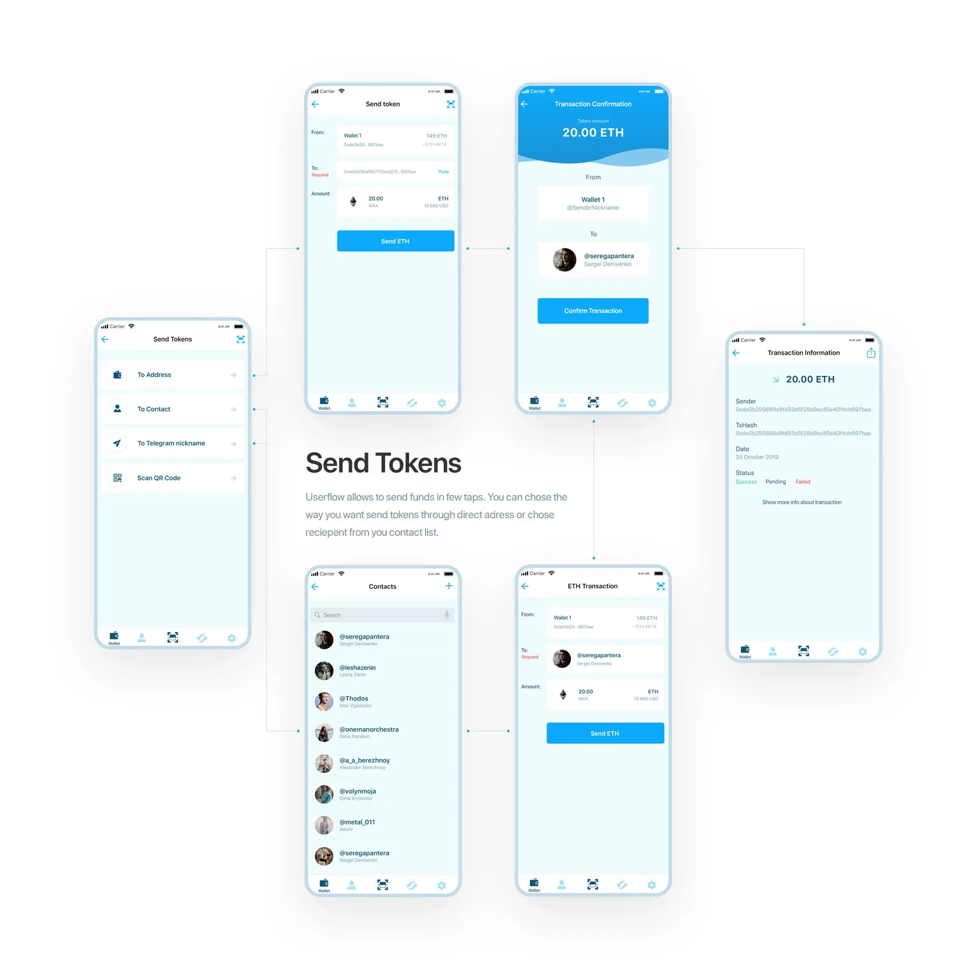
The BANKEX crypto wallet, which we designed in 2019, lets people send tokens to an address, a contact, a Telegram nickname or a scanned QR code. Each route ends on the same Transaction Confirmation screen: the amount large on a blue header, then From and To with the contact’s photo, then one Confirm Transaction button. The transaction information screen afterwards lists the sender, the hash, the date and a status of Success, Pending or Failed.
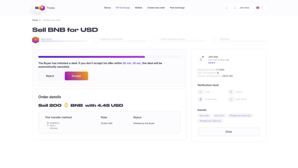
Banxe, a platform that joins fiat and crypto services, shows the harder case: a P2P deal between two strangers. A four-step stepper tracks the deal, a countdown says when the offer cancels itself, and beside it the counterparty panel lists registration date, transaction count, rating and verification level, with a Chat button. The trust check happens without leaving the order.
What does an investing app need to show?
An investing screen lists assets the way a broker does, with price, return and recent movement in one row, and keeps the buying step on its own panel. The decision and the action are separate on purpose.
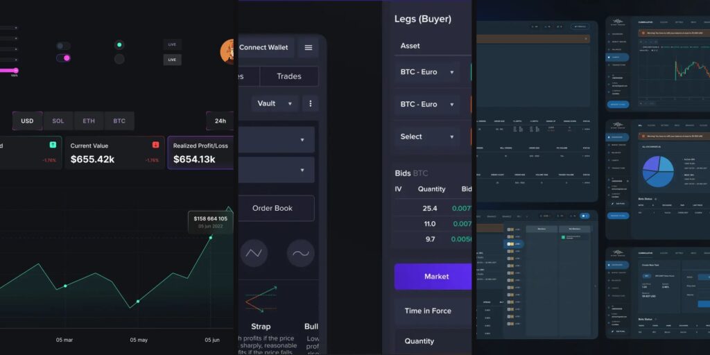
dEquity turns income-producing buildings into NFTs and lets investors trade fractions on its own DEX. Its Top offers to invest table lists buildings like stocks: property type and city, yield in green, price, a sparkline, ticker, total emission and a Details button. A property page splits into Information and Trading tabs, so facts about the building stay apart from the market, and Trading pairs a price chart with an order panel and a green Place Buy Order button.
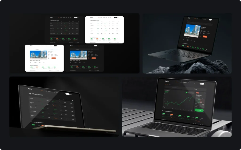
The design decision here: the website for first-time investors is light, white and pale blue, while the trading interface is its dark twin built from the same components. People who browse and people who trade get different surfaces without learning two products.
What does a lending app need to show?
A lending screen answers three questions on one view: how much is available, how much is still owed and when the next payment is due. Rates and the total cost belong before the user accepts an offer, not in a document linked from the last step.
We have no published lending case, so here is the checklist we would apply, taken from the patterns above:
- Available amount and outstanding balance as the two largest numbers
- Next payment amount and date on the home screen, not inside a menu
- The full cost of an offer shown before the accept button, the same way fees come before confirm in payments
- A repayment history readable without opening each row, like a bank statement
- Colour for meaning only: overdue in red, paid in green, everything else neutral
What does a banking app need to show?
A banking app shows all accounts with their balances first, then a history that can be read at a glance. When one person handles personal and company money, the two must look separate.
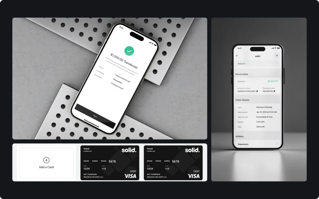
Solid gives businesses checking accounts, Visa debit cards and ACH, wire, card and check payments through a sponsor bank. In its Wallet app, accounts are grouped by owner, a person or a company, with a subtotal per group. History is split by month, each row carries a tinted tag for the payment rail, and colour appears only when it means something: green for money in, red for money out.

For more patterns shared by all four types, from receipts to fees before confirm, read our guide to fintech UX design. Our mobile app design page shows how we work on fintech and crypto apps.
Key takeaways
- Each type of fintech puts its own number on the first screen: payments the amount and recipient, investing the yield, lending the debt and due date, banking the account balances.
- Anything about cost must be visible before the confirm button: a person who learns about a fee after the money moves stops trusting the app.
- Decision and action sit on separate panels: in dEquity, facts about the building live on the Information tab and the buy order on the Trading tab.
Frequently asked questions
What are the main types of fintech, with examples?
Four are named most often: payments and transfers, investing, lending and digital banking, sometimes with insurance as a fifth. Examples from our cases: the BANKEX crypto wallet for payments, dEquity for investing in tokenized real estate, and Solid for business banking.
What are the 4 pillars of fintech?
Usually the same four areas: payments, investing, lending and banking. There is no official standard, and academic taxonomies can be finer, such as the nine categories in a 2021 study.
What are 5 examples of fintech?
A payments app for transfers, a crypto wallet, an investment platform, a digital bank with accounts and cards in an app, and an online insurance service. One product often combines several of these.
Is a crypto wallet a fintech app?
Yes. It stores and moves money, so it sits in the same payments and transfers category as other payment apps, and the design rules are the same: amount, recipient and network shown before confirming.
Why are trading interfaces often dark?
On a dark background, charts, green and red price changes and dense tables keep their contrast over long sessions. That is why, for example, the dEquity website for investors is light while its trading interface is a dark twin built from the same components.