How to Start Branding a Startup: What to Do Before the Seed Round and What Can Wait

Startup branding starts with three decisions: a name set as a wordmark, two or three colours and one typeface, used the same way in the pitch deck and in the product. Brand guidelines, icon sets and social templates can wait until the round closes. Below is the order, shown on identities thelegacy designed for Banxe, ARUS and Levens. The studio’s brand identity service covers the full system.
What does branding actually mean?
A brand is the set of features that tells your product apart from others; branding is the work of making those features consistent everywhere the company appears. The American Marketing Association (checked 9 November 2026) defines a brand as any distinctive feature, such as a name, term, design or symbol, that identifies goods or services.
For a startup the practical reading is narrower. Branding is not a logo file and not a marketing campaign. It is a short list of rules that decide how the name, the colours and the type look on a slide, a screen and a post. Our guide to what brand identity includes lists all its parts, and branding vs marketing explains where one ends and the other begins.
How do I start branding a startup?
Start with the name and the wordmark, then fix colours and type, then test them on one deck and one product screen. Everything else is an extension of those three decisions, and most of it can be postponed.
| Stage | What the brand needs now | What can wait |
|---|---|---|
| Pre-seed, building the product | Name, wordmark, two or three colours, one typeface | Brand guidelines, icon set, illustration style |
| Seed deck, first investor meetings | A deck that uses the same colours and type as the product | Social templates, merch, packaging |
| After the round, team growing | Written guidelines another designer can follow | Sub-brands, a full tone-of-voice document |
| Several products or markets | A system that covers every product line | Only what nobody uses yet |
Logo design for startups is a smaller job than it looks at this stage. A wordmark that reads at favicon size and on a dark slide is enough; a separate symbol is worth drawing when the product has an app icon or several product lines that need their own marks.
How do you make one visual language cover the brand and the product?
Pick one shape or one contrast and write it down as a rule, so the same decision shows up in the logo, the interface and the deck.
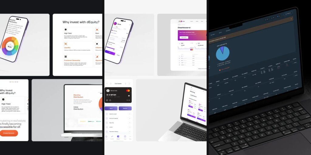
The Banxe identity rests on a hexagon. Five product lines, Crypto, Trading, Business, Ecology and Fiat Money, each get a hexagon mark with its own gradient. The guidelines also fix the proportions: graphite and lavender basics take 70 to 80 percent of a layout, violet accents 10 to 20, and the green and red info colours a sliver. Druk Wide is set for headings and numbers, Gilroy for secondary headings and content, so balances read wide and heavy while forms stay quiet.
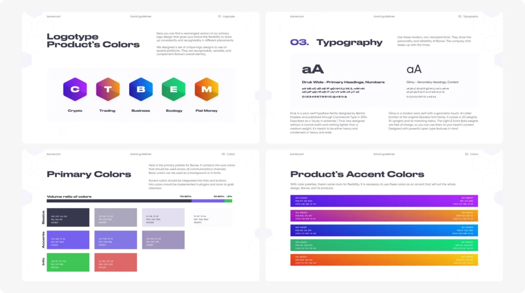
Because the hexagon is a written rule and not a decoration, it also works as a layout tool: the Wallet button in the centre of the tab bar is a violet hexagon, card actions sit in hexagon icons, and account analytics uses a hexagonal ring instead of a donut chart. The pitch deck reuses the same kit, so an investor who opens the app after the meeting sees the same product.
What should a brand for a money app signal first?
Where to act and what is safe. In a finance product, colour is a functional decision before it is a mood.
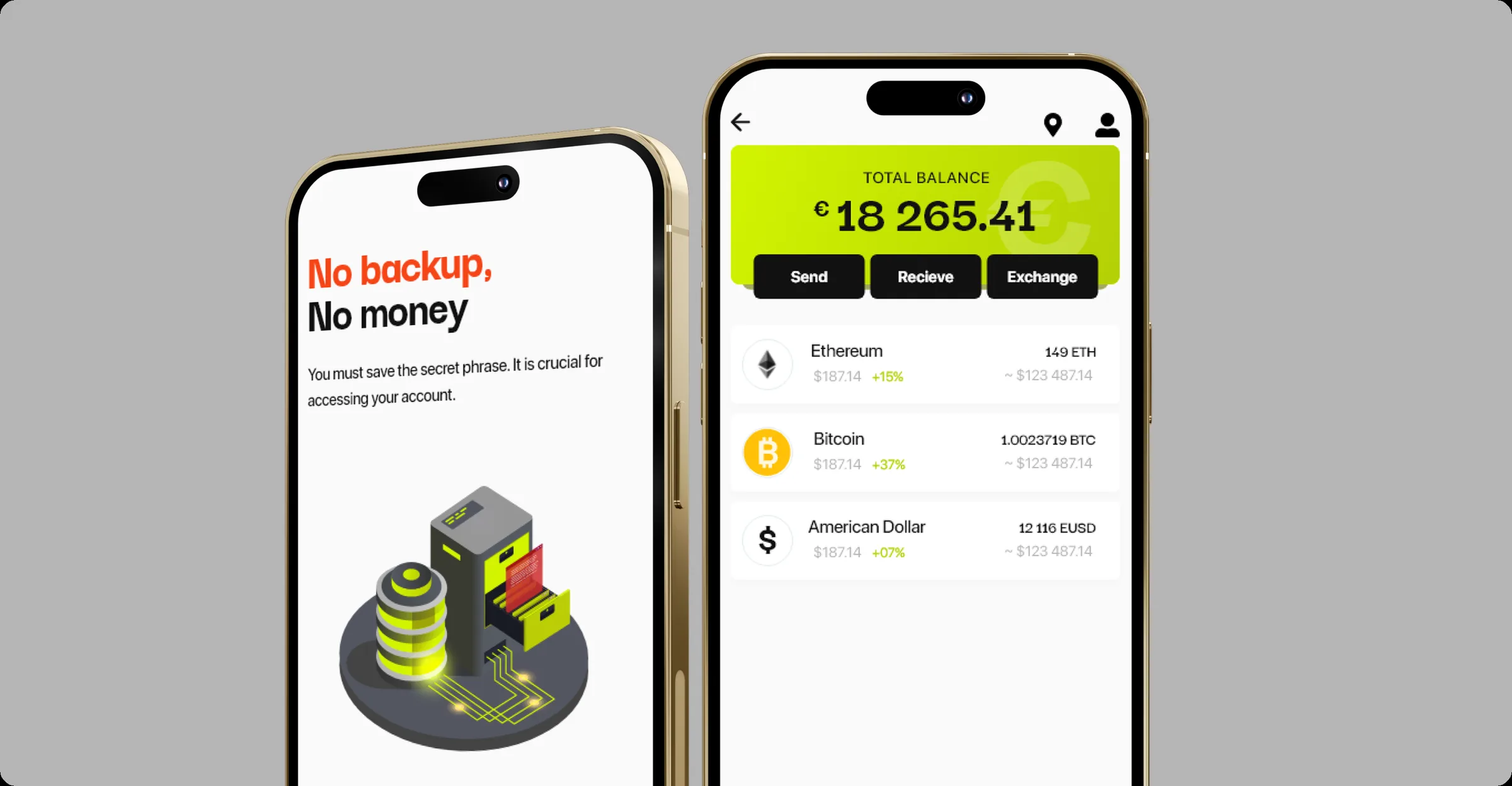
ARUS, a crypto wallet and exchange for small cash transfers, uses white screens, graphite type, acid lime for every action and one red-orange word in the headlines. The lime is never decorative: it marks the balance card and the buttons that move money or protect it, such as creating a backup. The website keeps the app’s palette and the same thin grey lines, so a visitor who installs the app sees no change of style.
When does a startup need full brand guidelines?
When people outside the founding team start making things with the brand: social posts, presentations, a catalog, a partner’s printed sheet. Until then, a one-page rule set is enough.
The Levens identity shows what the larger system looks like. A lowercase serif wordmark in deep teal carries a small gold oak leaf in the v, and the leaf then works as a marker on product cards, slides and posts. Nine line icons are drawn in the same thin white line as the pattern pictograms in the catalog. Every square post puts its headline on a frosted panel over an interior photo, with a strip of four wood tones along the top edge.
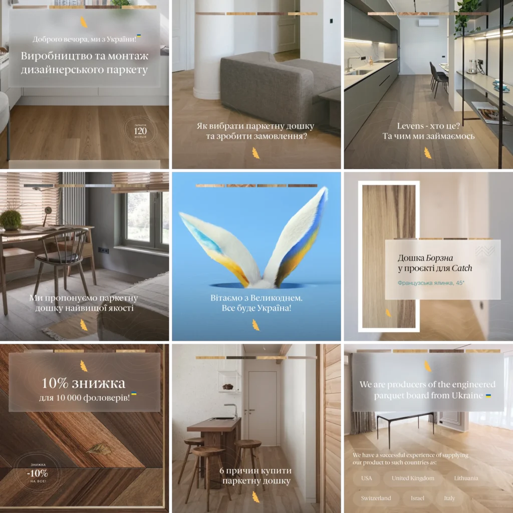
The point of guidelines is fewer new decisions, not more rules. Each new Levens surface reuses something already drawn: the leaf, the line icons, the wood strip.
Do web designers do branding?
Some do, and for a product startup it helps when the same team draws the logo and the screens. In all three cases above, thelegacy designed the visual language together with the website or the app, which is why the rules hold in the interface. When you hire, ask to see one project where the logo, the product screens and the deck come from the same hand.
Startup branding checklist before a seed pitch
- Wordmark in SVG, tested at favicon size and on a dark background, with a clear-space rule.
- Palette: one background, one action colour, one text colour, written down as hex values with a rough ratio.
- One typeface and the weights you actually use; a second one only for a deliberate contrast, such as numbers.
- Deck template: cover, section divider, text slide and product screenshot slide in the same colours and type.
- One real product screen made in this language, to check the brand survives real content.
If the company already has a name and customers, the job is different: read our guide to rebranding before changing anything. For a new identity, see how thelegacy approaches brand identity design.
Key takeaways
- Before the seed round a startup needs a wordmark, two or three colours and one typeface that look the same in the deck and in the product; guidelines, icons and social templates come later.
- A brand rule earns its place when it also works in the interface: the Banxe hexagon is the centre tab button, the card icons and the analytics ring.
- Full guidelines are needed when people outside the founding team start making posts, slides and catalogs with the brand.
Frequently asked questions
How do I start branding a startup, and what does branding actually mean?
Branding means making the features that set your product apart, such as the name, the mark, the colours and the type, look the same everywhere the company appears. Start with the name and a wordmark, fix two or three colours and one typeface, then test them on a pitch deck and one real product screen. Guidelines and templates can follow after funding.
Is a logo enough for a startup brand?
A logo alone is not enough, but it is less work than founders expect. What makes a startup look consistent is the logo together with a fixed palette and one typeface, applied the same way on slides and screens. A separate symbol is worth drawing once there is an app icon or several product lines.
Should the pitch deck or the brand come first?
The basic brand comes first, even if it takes only the wordmark, colours and type. A deck designed before those decisions usually has to be redone, and investors who open the product after the meeting notice when the deck and the app look like two different companies.
Can a startup do its own branding?
A founder can pick a name, a font and a couple of colours and keep them consistent, and that is better than a polished logo used inconsistently. A designer becomes useful when the brand has to work inside a product interface, in a deck and on several channels at once, because then the rules need to be written and tested.
How many colours should a startup brand have?
Two or three working colours are enough at the start: one for the background, one for actions and one for text, plus green and red if the product shows gains, losses or errors. Writing down a rough ratio, for example how much of a screen the accent may take, keeps the brand recognisable as more people use it.