What is brand identity: what it includes and how it differs from a logo

What is brand identity? It is the set of rules that makes a company recognisable wherever it appears: a logo in several versions, colours with fixed roles, typefaces, icons, imagery and tone of voice, all written down in guidelines. A logo is one part of that set. Below, each part is shown on Banxe, Levens and Fozeus, identities designed by thelegacy.
We design these systems as part of our brand identity work. This guide explains what to ask for and how to check that you got a system, not a single file.
What is brand identity, and how is it different from a logo?
A logo identifies the company in a small space; the identity tells everyone what to do in all the other space. The logo answers “whose is this?”, while the identity answers the questions that come next: which colour goes on a button, which typeface sets a price, what a social post looks like, how an error message sounds.
A simple test: hide the logo on a screen, a slide or a post. If people can still tell whose it is, the identity is working. If the page turns anonymous, the company has a logo and little else.
Identity is also narrower than “brand”. The brand is what people think and feel about a company, which nobody fully controls. The identity is the part a designer can control and hand over as rules.
What does a brand identity include?
A working identity has eight parts. Not every company needs all of them on day one, but each one closes a question that otherwise gets answered differently by every person who touches the brand.
| Part | Its job | Example from our cases |
|---|---|---|
| Logo and its versions | Recognition in any size and on any background | Banxe: one hexagon form, lettered C, T, B, E, M for five product lines |
| Colour palette with roles | Says which colour does what and in what share | Banxe: graphite and lavender basics take 70 to 80 percent of a layout, violet accents 10 to 20 |
| Typography | Gives headings, numbers and body text their own voice | Banxe: Druk Wide for headings and numbers, Gilroy for content |
| Icons and pictograms | Carry the brand into navigation and small details | Levens: nine line icons in the same thin line as the catalog pictograms |
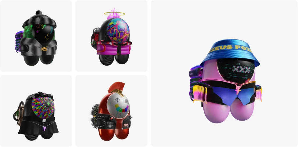
| Imagery and 3D | Decide what the brand’s pictures show and how | Fozeus: 3D characters built on the astronaut from the logo |
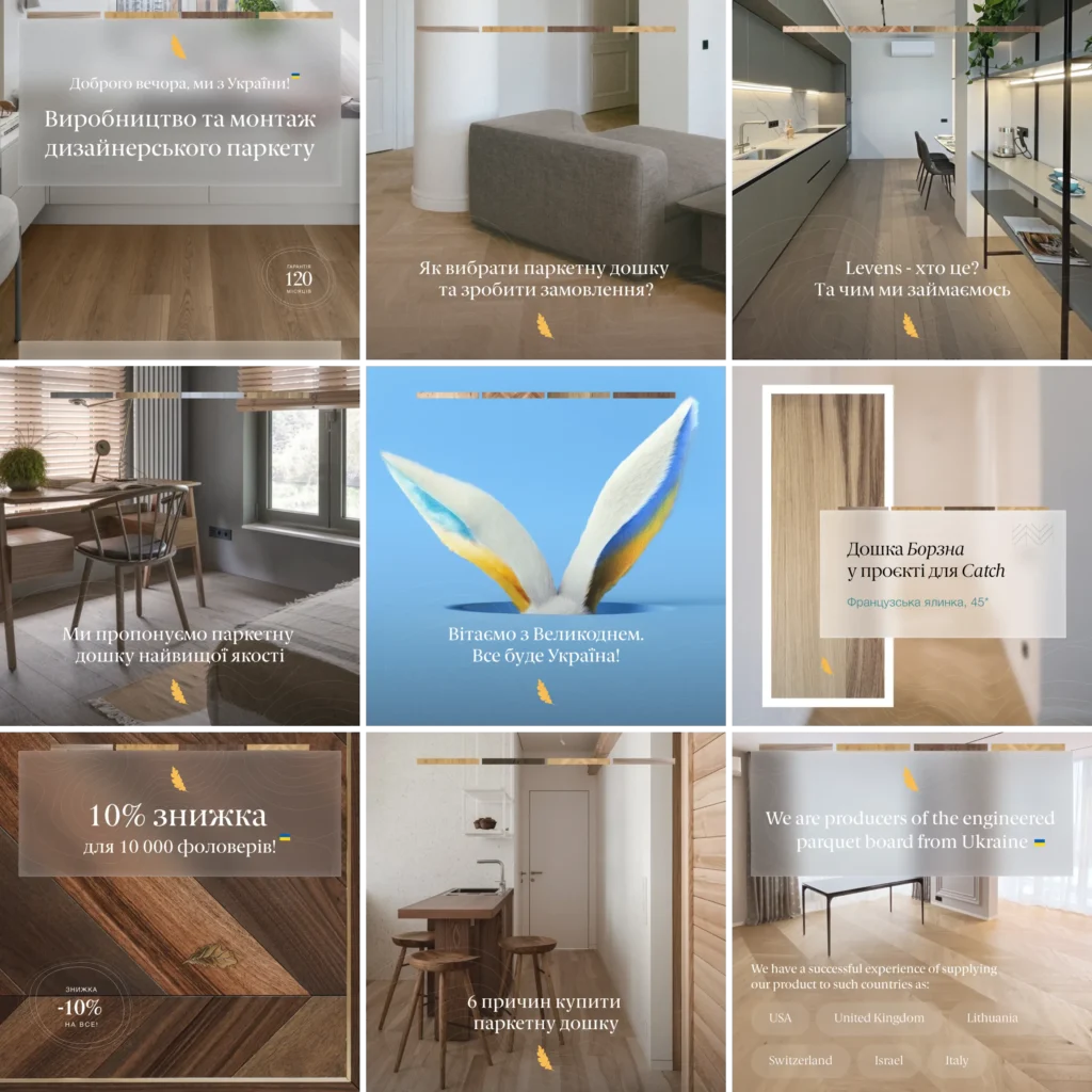
| Templates | Let new posts and slides appear without a designer | Levens: Instagram posts with a frosted panel, a strip of wood tones and the gold leaf |
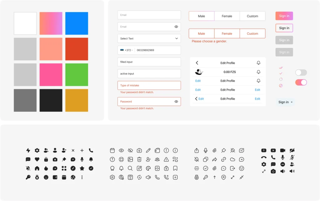
| Product layer (UI kit) | Turns brand rules into buttons, inputs and states | Fozeus: palette, input states, buttons and three icon sets in one kit |
| Guidelines | Write all of the above down with right and wrong uses | Banxe: logo, colours and typography pages with usage notes |
Why does one logo need several versions?
Because the same company appears in an app icon, a page header, a social avatar and a slide footer, and one file cannot fit all of them. A logo package usually includes a full version, a compact mark for small sizes and versions for dark and light backgrounds.
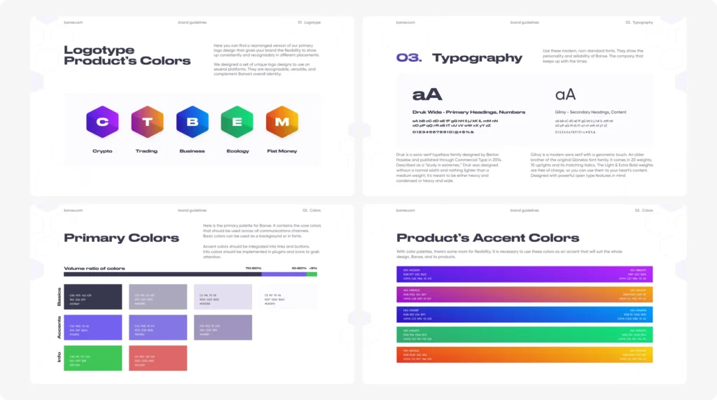
For Banxe, a platform that joins fiat and crypto services, the versions also had to separate products. The brand guidelines give five product hexagons, Crypto, Trading, Business, Ecology and Fiat Money, each with its own gradient. The shape stays the same, so a person moving from the exchange to the wallet still knows it is one company; the letter and the gradient tell them which product they are in. The same lettered hexagons later became badges on social post templates and the raised Wallet button in the app’s tab bar.
The design decision behind it: one strong form that varies by colour is easier to keep consistent than five unrelated marks, and it leaves room for a sixth product without a new logo project.
How do colours and typography work inside an identity?
A palette in an identity is a list of roles and proportions, not a list of swatches. It says which colours are backgrounds, which are for actions, which signal success or error, and roughly how much of a screen each one takes.
The Banxe guidelines put this as a volume ratio: basics in graphite and lavender take 70 to 80 percent, violet accents 10 to 20, and the green and red info colours only a sliver. That is why the product screens look calm and the purple buttons are easy to find. Typography is split the same way: Druk Wide, wide and heavy, for primary headings and numbers; Gilroy for secondary headings and content. Balances and page titles read loud, forms stay quiet.
Fozeus, a crypto social network where members mine the FZS token, shows the same principle in a product. Its interface stays on white and pale grey, and the coral-to-lilac gradient from the astronaut-on-a-whale logo marks only the key actions: Start mining, Sign in, Publish, Request to Follow. The brand colour works as a signpost because it is rare.
Does a brand need its own icons and imagery?
If the brand lives on a website, in an app or in social feeds, yes: icons and pictures are where generic libraries make every company look alike. Custom ones do not need to be many; they need to share one drawing rule with the logo.
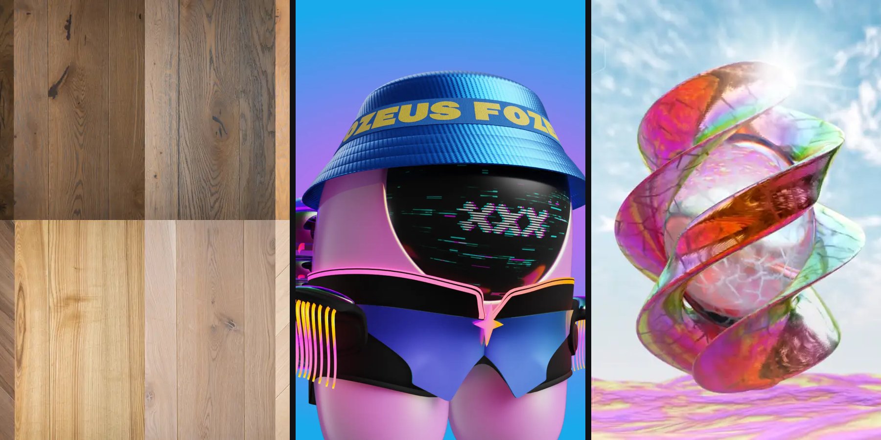
Levens, a Ukrainian maker of engineered oak and ash parquet, is a good example from outside fintech. Its identity rests on a lowercase serif wordmark in deep teal with a small gold oak leaf tucked into the v. Nine line icons sit on wood tiles: the leaf, a speech bubble with a heart, a light bulb, three laying patterns, a location pin, a ruler with a pencil and a hard hat. They are drawn in the same thin white line as the laying-pattern pictograms in the website catalog, so the brand and the interface share one hand.

Templates are the part of imagery most companies forget. Every Levens Instagram post sets its headline on a frosted, semi-transparent panel over an interior photo, with a strip of four wood tones along the top edge and the gold leaf below. Anyone on the client’s team can drop in a new photo and a new line, and the post still looks like Levens.
3D can be part of the identity too. For Fozeus, the astronaut from the logo became a cast of NFT characters. Every character shares one base: a rounded capsule body, a glossy visor, two short legs and a pack on the back. Wardrobe and finish carry the variation. Fixing the structure and varying the surface is what let the series be generated in the thousands and still read as one family.
What should brand guidelines contain?
Guidelines are the manual that lets people apply the identity without calling the designer. They show rules and examples, not a gallery of finished work. Use this checklist when you receive them:
- Logo: every version, clear space, minimum size, and examples of wrong use
- Colour: values for screen and print, the role of each colour and its share of a layout
- Typography: typefaces, what each one sets, the size scale
- Icons: the drawing rule (line weight, corners), sizes, the full set
- Imagery: what photos and illustrations show, 3D or character rules if there are any
- Templates: social posts, slides, documents, with editable source files
- Product layer: buttons, inputs and their states, if the company has an app or a web product
- Tone of voice: how the brand writes headlines, buttons and error messages, with examples
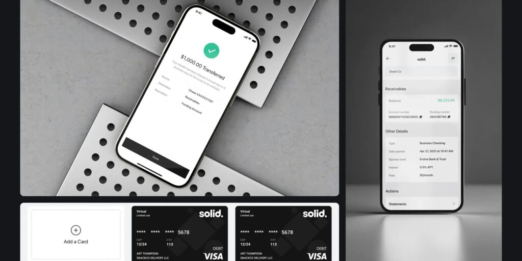
Banxe went one step further: the identity came with an app prototype wired with flows for account creation, cards, transfers and payment history, so developers saw the brand in motion, not only on static pages.
How is a brand identity built?
An identity is built from the questions it has to answer, then tested on the places where it will live. The order below is the one we follow:
- Brief and research. What the company does, for whom, who the competitors are and what their identities look like.
- Direction. Two or three routes, each shown on real surfaces: an app screen, a page, a post, a slide.
- Logo and core rules. The chosen route gets its logo versions, palette with roles and typography.
- Extension. Icons, imagery, templates and, for digital products, the UI kit.
- Guidelines and files. Everything written down, with source files the team can edit.
The step people want to skip is the second one. A mark that looks strong on a white presentation slide can fall apart as a 32-pixel app icon or on a dark trading screen. Showing every route on real surfaces is how that gets caught before the work is final.
Where should you start with your own brand identity?
Start by listing every place your brand already appears, from the app icon to the investor deck, and mark which of them follow written rules. The gaps on that list are your brief. If the company already has a logo and customers who know it, read our guide to rebranding before changing anything; if you are launching a token, the token launch branding checklist lists the assets you need first. For the difference between identity work and promotion, see branding vs marketing.
When you are ready to build the system itself, our brand identity page shows how we work and more cases.
Key takeaways
- The test of a brand identity: hide the logo on a screen or a post. If people still know whose it is, the system works.
- A palette is roles and proportions, not swatches: at Banxe, basics take 70 to 80 percent of a layout and accents 10 to 20, which is why the buttons are easy to find.
- Templates and the UI kit are the parts most often forgotten, yet they are what holds the brand when no designer is in the room.
Frequently asked questions
Is brand identity the same as branding?
No. Branding is the wider work: positioning, the name, the brand promise and how the company behaves. Brand identity is its visual and verbal part: logo, colours, typefaces, icons, templates, tone of voice and the rules for using them.
What is the difference between brand identity and brand image?
A company creates and controls its brand identity: the rules for how it looks and sounds. Brand image is how people perceive the company, shaped by experience, reviews and news. A good identity helps the image but cannot replace it.
Does a startup need a full brand identity before launch?
Usually not. At launch, a logo in the right versions, a palette with roles, typefaces and templates for the website, deck and social posts are enough. Icons, 3D and a full UI kit can follow when the product does, as long as the base was designed with room to grow.
What files should you receive at the end of brand identity work?
The logo in every version as vector and raster files, the guidelines as a PDF, font files or licence links, the palette with codes for screen and print, editable template sources and, for digital products, a UI kit in Figma.
Can you update a brand identity without a full rebrand?
Yes. Often it is enough to refresh the typefaces, adjust the palette, or add logo versions and templates while keeping the mark customers already know. A full rebrand is for a change of positioning, name or audience.