Fintech Pitch Deck: Slide-by-Slide Structure from Five Real Decks

A fintech pitch deck answers eight questions in a fixed order: what is broken, how you fix it, what the product looks like, how big the market is, how you earn, who you are, what you have already proved, and what you need. Seed and Series A decks keep that order and differ in how much proof each slide carries.
Each slide below is shown on five decks we designed: Banxe, dEquity, Amdax, Skynet Trading and Arch. For the full slide order of eleven decks, see pitch deck examples. If you want a deck designed rather than described, start with pitch deck design.
What slides does a fintech pitch deck need?
A cover, a problem, a solution, the product, the market, the business model, proof, the competition, the team and a closing slide with the ask. The table shows how that list changes when the deck is a services presentation, as with Amdax and Skynet Trading, instead of an investor deck.
| Slide | The question it answers | Investor deck | Services deck |
|---|---|---|---|
| Cover | Who are you, in one line | Yes | Yes |
| Problem | What is broken today | Yes | Sometimes |
| Solution | How your product fixes it | Yes | As the offer |
| Product | What it looks like and how it works | Yes | As the service menu |
| Market | How big the opportunity is | Yes | Rarely |
| Business model | How you earn | Yes | As the offer |
| Proof | What already works | Yes | Clients and quotes |
| Competition | Why you, not the alternatives | Yes | Sometimes |
| Team | Who will deliver | Yes | Yes |
| Ask or contacts | What happens next | The round | Contacts |
How do the problem and solution slides work in fintech?
The problem slide has to make the gap visible before the product appears. In fintech the gap is usually a split between two things that should work together, so the best problem slides draw the split.
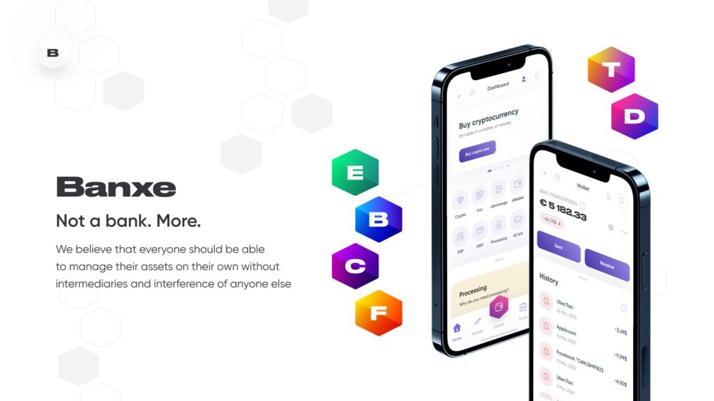
The Banxe deck opens with one. Two slides set fiat and crypto up as separate worlds with different tools, and a third compares their yields: a flat dark bar for euro deposits next to a tall magenta-to-violet bar for crypto. The gap between the bars is the argument. The solution slide answers with one large white tile ringed by the lettered hexagons for each product, and the next slide puts the account analytics screen into two phones.
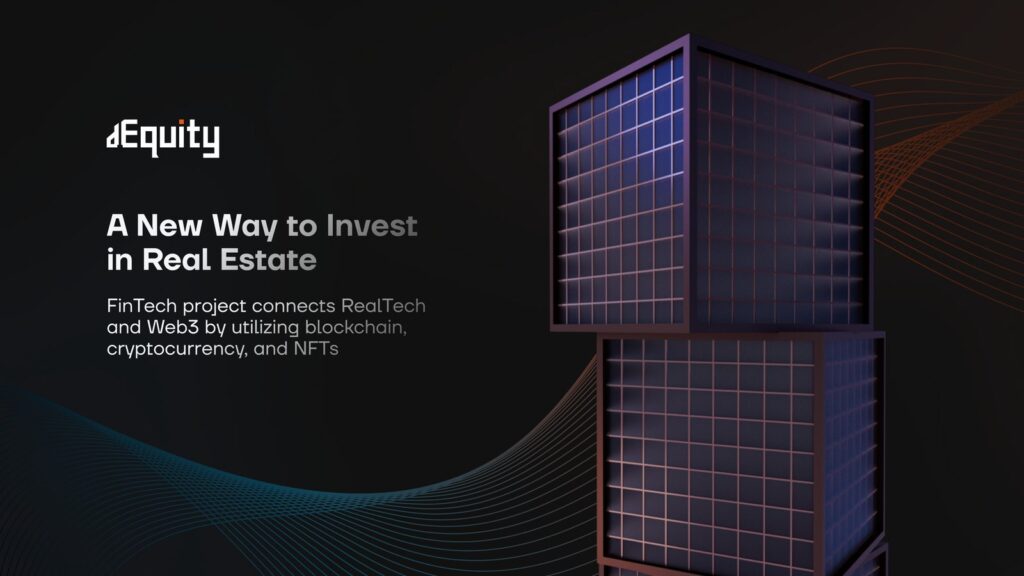
dEquity does the same for real estate. Its solution slide lays a green area chart behind the text and sets the annual yield in bold orange, so the promise is a number you can see rising.
Our rule for a problem slide: show it as a bar, a chart or an object, not as a sentence. The yield bars at Banxe are the clearest example we have designed.
What should the product slide show?
Real screens of the real interface, the way an investor would see them if they opened the app. A feature list, a wireframe or an architecture diagram all make the reader imagine the product instead of seeing it.
Banxe places the app in phones from the cover to the close, so by the funding slide the investor has seen the product many times in context. dEquity gives three of its product slides mostly to the platform: the top offers table with a sparkline for each building, the trading view with its price chart and order panel, and a property page with a photo and an orange Invest button.
How do you show market size and the business model?
Draw the market as a chart in the brand’s own colours and keep the number tied to the product. A big figure with no connection to what you sell proves nothing.
Banxe keeps it to three vertical bars on the market growth slide, from a thin magenta line to a tall yellow-to-orange column, so the direction reads before any label. The business side uses the product lines. On its product lines slide each of six lines, Fiat, Crypto, Ecology, Business, DeFi and Lifestyle, gets a lettered badge in its own gradient and a few plain lines of services. If the product has a token, as at Banxe, it gets its own slide with what the token does: staking, fee discounts and activity rewards.
What makes a competitor slide work?
A table whose verdict is visible before anyone reads it. That is the one principle we apply to seed and Series A decks alike.
The dEquity competitive landscape compares the platform with direct purchase, REITs and another tokenization platform across seven criteria. Where an option falls short, the answer is grey; where it delivers, it is white. The dEquity row is the only one that is white from end to end. Banxe shows its competitors as horizontal bars sorted from shortest to longest beside a table grouped by type of company, and Arch uses a four-column table with a green tick or a red cross for each feature, from rehypothecation to insured custody.
How do seed and Series A decks differ?
The order stays the same; the weight shifts. This is our reading as designers, not a finding from the five decks, because we do not claim to know which round each of them served.
An early deck has little to prove, so the problem, the product screens and the team carry it. A later deck needs evidence in the middle: traction, volume or revenue charts, named customers, a clear use of funds. If you have no numbers yet, leave the slide out or write plainly that you are pre-revenue. A placeholder chart costs more trust than the honest label. For the structure of a crypto raise in particular, see how to make a crypto pitch deck.
How does a fintech services deck differ from an investor deck?
A services deck answers “can this firm do the job?” instead of “will this company grow?”. The market slide goes, proof becomes clients and quotes, and the product becomes a menu of services.
Amdax is eleven slides: the firm, four service pillars one by one, the leadership team and contacts. Every pillar slide is built the same way, with a blue label, a grey headline and an amber lead sentence, so the deck reads as a series. Skynet Trading is twelve slides on a dark, star-lit ground. After the about slide and a four-figure numbers grid, it explains its model as three cards, Autonomy, Innovation and Transparency, with a screenshot of the client dashboard running off the edge. Then each service gets a slide with a chart drawn large behind the copy: an order book depth chart for market making, a rising green curve for trading strategies.

Checklist: what to check before sending a fintech pitch deck
- One frame from cover to close. Fix the grid, headline style and colours before any single slide. Banxe uses its hexagon tiles on every slide; dEquity keeps one dark ground and one orange rule.
- The product is a real screen. A screenshot of the interface, placed beside the claim it supports, not an illustration used as decoration.
- The competitor table works without a paragraph. If it needs an explanation, the table is not finished.
- Market numbers are drawn. A chart in the brand colours shows the direction before the label is read.
- Regulation has a slide. Fintech investors look for the licence, the custody model or the registration. The Amdax introduction names its registration with the Dutch Central Bank, and Arch compares itself with other lenders on custody.
- The last slide asks for one thing. The amount and its use for an investor deck; a contact and a next step for a services deck.
How many slides should a fintech pitch deck have?
As many as the sections need, with one question per slide. The five decks here run from nine slides to nineteen, and the count follows the product, not a rule.
Arch needs nine because it sells one thing, a loan backed by cryptocurrency, and works it through in a small table with the effective result in the only cell filled with copper. Amdax and dEquity take eleven, Skynet Trading twelve, and Banxe nineteen because it presents six product lines. Add a slide when a line genuinely needs its own page; cut one when two slides answer the same investor question.

What design decisions matter most in a fintech deck?
Three things separate a deck that reads as a whole from a pile of slides.
Brand colours become chart colours. When the market bars use the same gradients as the product hexagons, the chart belongs to the product story. At Banxe the crypto yield bar is drawn in magenta and violet, the colours of the crypto hexagon.
One level of hierarchy for headings and one for labels. Skynet Trading uses monospace for labels and numbers, so the two kinds of information stay apart without a second typeface.
The last slide returns to the first. Amdax closes on the charcoal and yellow stripes of its opening, and dEquity ends on one line and an orange contact address on its dark ground.
If you are still deciding between a template, an AI tool and a designer, pitch deck template, AI generator or designer lays out the trade-offs. To have your deck built on your product’s own visual language, see pitch deck design.
Key takeaways
- The order of slides is fixed: problem, solution, product, market, business model, proof, team, ask. Between seed and Series A only the weight of the proof changes.
- The problem slide and the competitor table work when they are readable without text: the yield bars at Banxe, the white row against grey at dEquity.
- The product is shown as real screens, and the product sets the slide count, from nine at Arch to nineteen at Banxe.
Frequently asked questions
Does a fintech pitch deck need a tokenomics slide?
Only if the product has a token. Banxe has a BNX token slide because staking, fee discounts and activity rewards are part of the product, and dEquity shows its tokenomics as two donut charts. Amdax, Skynet Trading and Arch have no such slide.
How do you show traction when there is none yet?
Show what exists: a product screen with real data, clients, or a client quote. Skynet Trading uses testimonial cards and a screenshot of its client dashboard, and Arch sets a client quote large. Invented figures hurt a deck more than an honest note that there is no revenue yet.
How is a fintech deck different from a general startup deck?
It spends more attention on regulation and custody of funds. The Amdax case introduction names its registration with the Dutch Central Bank, and Arch compares itself with other lenders on custody in a table. General startup decks include such slides less often.
Can one deck serve both investors and clients?
It is better to make two files on one visual frame. An investor deck proves growth; a services deck proves the firm can do the job, so it carries different proof and a different closing slide.